I was hoping for your help with something.
-
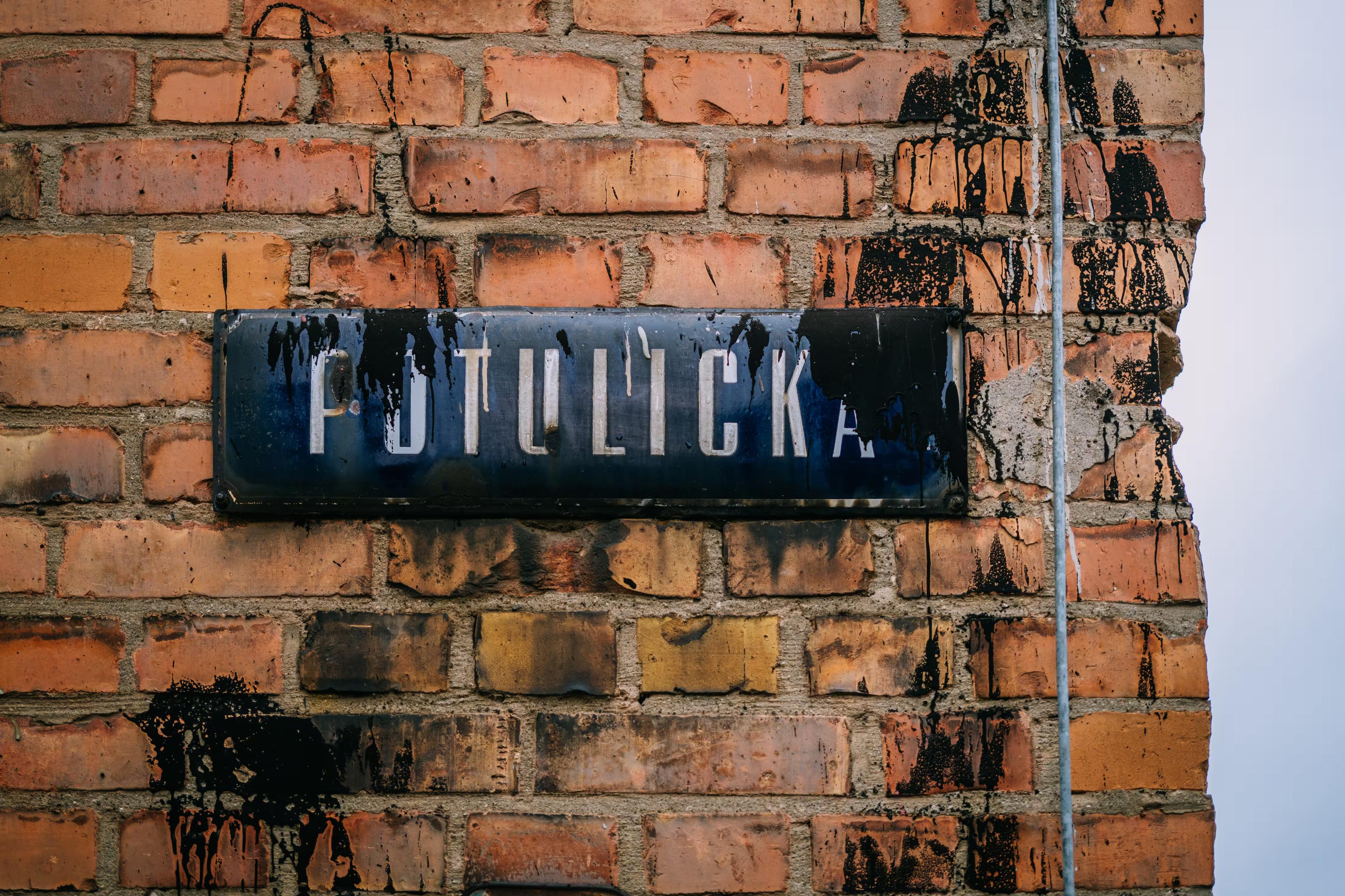
@mwichary As a Finnish person, those signs are everywhere around the cities and roads. As a typeface it is not that much liked, but it is readable.
Street signs have different typeface that has a bit more nicer feeling, but the reading distance is smaller for those, so typeface details can look more beautiful (compared to traffic signs).
@autiomaa Thank you!
-
Metron by Jiří Rathouský (1973), Prague Metro, Czechia. Digitized by František Štorm.
@chemlon I love this one!
-
@mwichary @brunogirin but there's also the UK street name font, most recently known as Kindersley Street or Kindersley Grand Arcade — https://wemadethis.co.uk/blog/2022/02/street-name-fonts/
(also a product of a fight between two type designers)
@scruss @brunogirin Thanks!
-
I'm Scottish. I'd say the two obvious candidate are Transport, the font used on all UK road signs (although the kerning on this example is terrible), and Reith Sans – the house font of https://www.bbc.co.uk/
@se_davidobrien @mwichary Transport is also used on https://www.gov.uk/ and one of the reasons that site is so good (not always in terms of content, of course).
-
3.
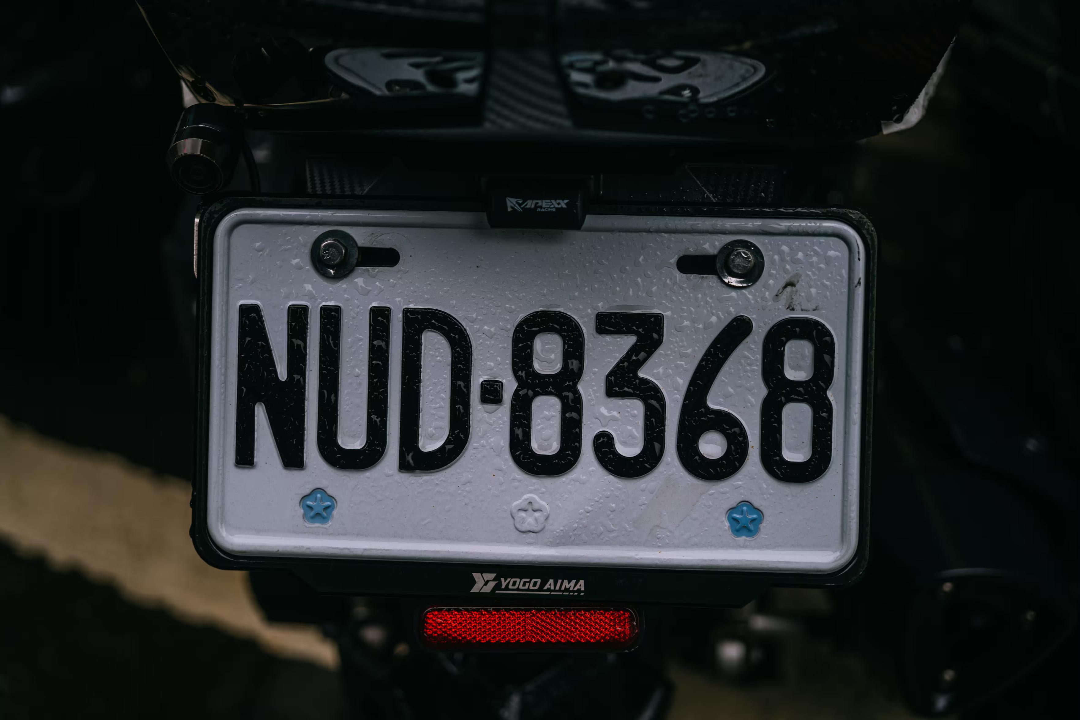
Taiwan has this characteristic license plate font with a droopy 6 and a cool 3. The digit 4 doesn’t appear very often because of bad luck, so when it does, it seems to be celebrated maybe? (Last photo.)@mwichary I love the Q!
-
I was hoping for your help with something.
Is there a particular font that’s instantly recognizable to someone who lives where you do, and appreciated/recognized/hated there, but completely unknown elsewhere? Something on road signs, street names, transit, infrastructure, stuff like that? I’ll share some examples in the thread.
I’d love to learn more about these. I’m not afraid of links in languages I don’t understand, ha.
(Also please repost for reach if you are willing!)
Thank you!
@mwichary I've lived a couple years in the Basque country, where there is a local font style (not a single font though)
-
@joostvb Oh, yeah, classic! Also Dutch railways, right?
@mwichary yes, customized frutiger it seems, see https://www.stoerebinken.nl/werk/nederlandse-spoorwegen/ .
-
@florine Do you know if it’s specific to a region, or all over the country?
@mwichary all over, I think. And at least 50 years old
-
6.
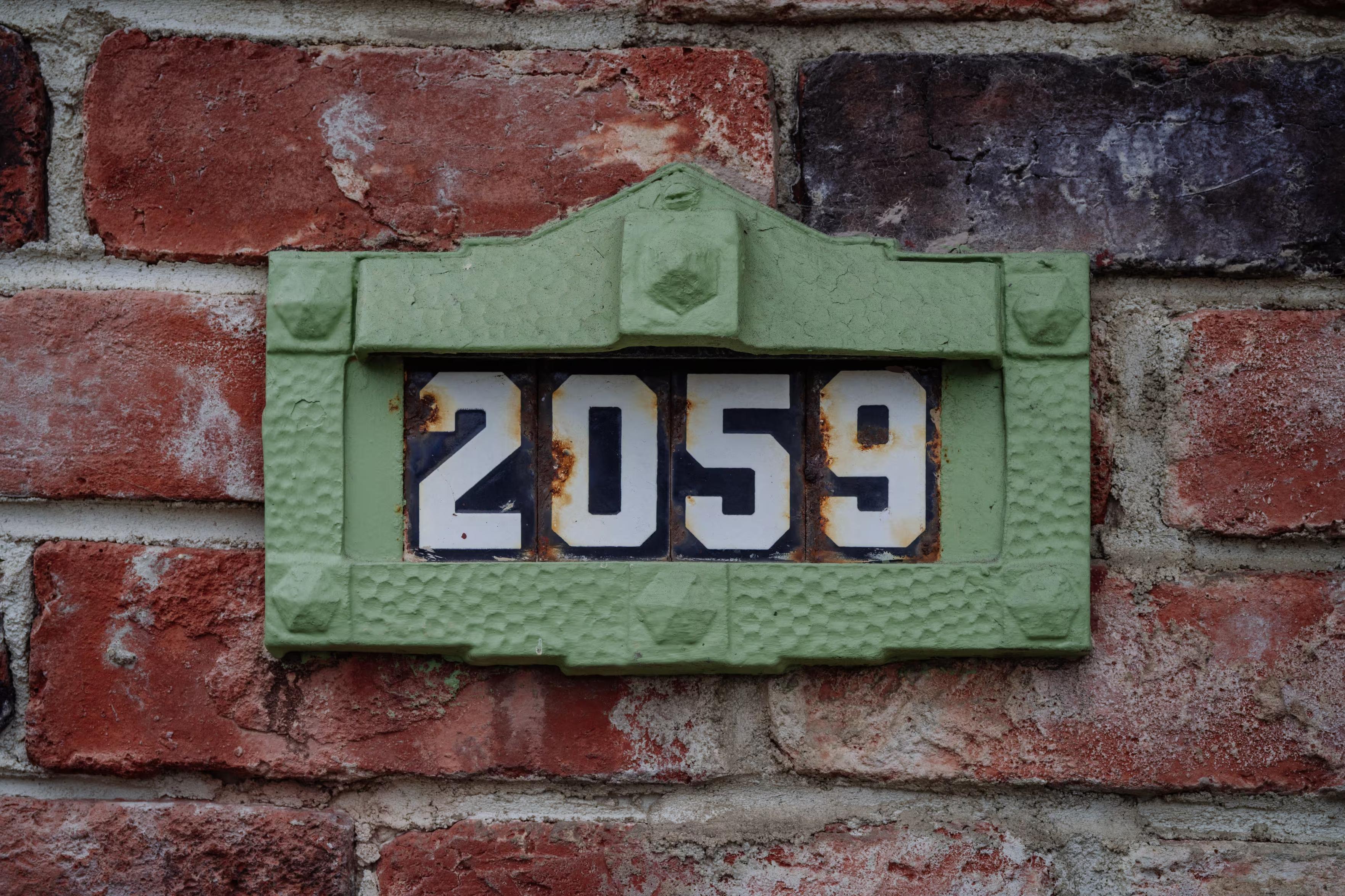
Also in San Francisco, there are these classic distinctive house numbers.The story is here if you are curious: https://sunnysidehistory.org/2020/07/15/the-little-sculpture-affixed-your-house-anton-fazekas/
7.
East Germany used a particular version of Gill Sans. I love these signs. Very hard to find photos these days. -
@mwichary all over, I think. And at least 50 years old
@florine Thanks!
-
I was hoping for your help with something.
Is there a particular font that’s instantly recognizable to someone who lives where you do, and appreciated/recognized/hated there, but completely unknown elsewhere? Something on road signs, street names, transit, infrastructure, stuff like that? I’ll share some examples in the thread.
I’d love to learn more about these. I’m not afraid of links in languages I don’t understand, ha.
(Also please repost for reach if you are willing!)
Thank you!
@mwichary I've seen it pop up in one or two non-Chicago things, but I'd say the Big Shoulders font family qualifies. Locals probably mostly don't know the name, but it's on a lot of Chicago stuff (not just official city things, either, though sometimes on stuff that wants to seem like it) and not really anywhere else.
-
I was hoping for your help with something.
Is there a particular font that’s instantly recognizable to someone who lives where you do, and appreciated/recognized/hated there, but completely unknown elsewhere? Something on road signs, street names, transit, infrastructure, stuff like that? I’ll share some examples in the thread.
I’d love to learn more about these. I’m not afraid of links in languages I don’t understand, ha.
(Also please repost for reach if you are willing!)
Thank you!
@mwichary Tilburg (the Netherlands) has TilburgsAns (sic): designed by two local artists as a tribute to the town, and has since been adopted almost everywhere: billboards, monuments, labels on local products (even my blog
 )
)The news section of their website has many examples of usage: https://www.tilburgsans.nl/en/news/
-
@ricci Thanks! You don’t happen to have a photo or a hint on how to find one?
@mwichary I'm sure I have some in my photo storage somewhere, but am failing to find them - I'm sure I can find or take some new ones soon
-
7.
East Germany used a particular version of Gill Sans. I love these signs. Very hard to find photos these days.@mwichary Gill, the guy who did terrible things to his daughter and dog and wrote it down? https://www.telegraph.co.uk/news/2022/04/28/christies-cancels-paedophile-artist-eric-gill-abused-daughters/ #thingsthatcannotbeunseen #thingsthatcannotbeforgotten
-
@mwichary Gill, the guy who did terrible things to his daughter and dog and wrote it down? https://www.telegraph.co.uk/news/2022/04/28/christies-cancels-paedophile-artist-eric-gill-abused-daughters/ #thingsthatcannotbeunseen #thingsthatcannotbeforgotten
@grmon Oh shit, I wasn’t aware of the extent of all this.
-
@mwichary there's the house face of the TTC subway in Toronto which is similar but different than Johnston Sans
@secretasianman @mwichary I wish the TTC would use it more consistently, and more whole-heartedly embraced it.
-
@mwichary @secretasianman there's a whole saga about how the Toronto's TTC was going to release a free version of the font, but had a massive falling out with the project proponent.
@scruss @mwichary @secretasianman There are “unofficial” versions floating around.
-
7.
East Germany used a particular version of Gill Sans. I love these signs. Very hard to find photos these days.8.
Modern Germany has a specific license plate font that's designed to be hard to mess with. It is also used to mark parking spots. -
I was hoping for your help with something.
Is there a particular font that’s instantly recognizable to someone who lives where you do, and appreciated/recognized/hated there, but completely unknown elsewhere? Something on road signs, street names, transit, infrastructure, stuff like that? I’ll share some examples in the thread.
I’d love to learn more about these. I’m not afraid of links in languages I don’t understand, ha.
(Also please repost for reach if you are willing!)
Thank you!
@mwichary there is a very ugly black letter font here in Annaberg-Buchholz #tourist #workation sometimes with perfect usage of German long-s and for the same street with wrong end-s . Gonna try to snatch some pictures.
-
I was hoping for your help with something.
Is there a particular font that’s instantly recognizable to someone who lives where you do, and appreciated/recognized/hated there, but completely unknown elsewhere? Something on road signs, street names, transit, infrastructure, stuff like that? I’ll share some examples in the thread.
I’d love to learn more about these. I’m not afraid of links in languages I don’t understand, ha.
(Also please repost for reach if you are willing!)
Thank you!
@mwichary david kindersley’s lettering, designed for motorway road signs, but rejected, and instead relatively popular for street name signs (especially in his home town cambridge)
https://www.flickr.com/photos/36844288@N00/albums/72157621886573981/
https://wemadethis.co.uk/blog/2022/02/street-name-fonts/
https://thebeautyoftransport.com/2021/11/03/how-serifs-lost-the-road-war-but-won-the-streets/