I was hoping for your help with something.
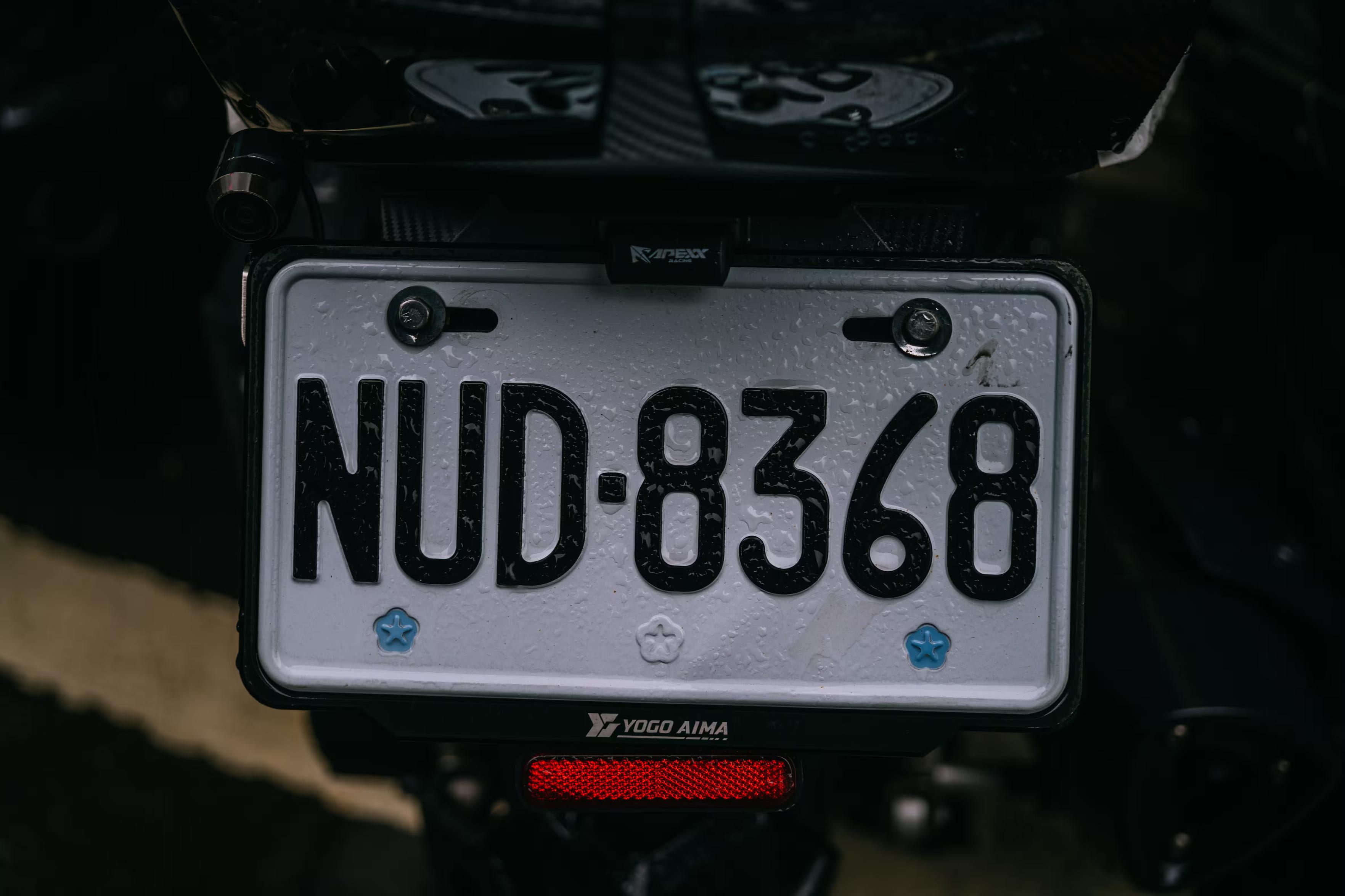
-
@mwichary I've seen it pop up in one or two non-Chicago things, but I'd say the Big Shoulders font family qualifies. Locals probably mostly don't know the name, but it's on a lot of Chicago stuff (not just official city things, either, though sometimes on stuff that wants to seem like it) and not really anywhere else.
@aschmitz That’s interesting since I live here, but didn’t notice it? Do you have a go to example or two?
-
@kallekn Wow, this feels much older than 1984.
@mwichary I remember wondering if the sign had been there since before the war, but that hardly seems possible.
-
@mwichary especially the lowercase i of the head font is somewhat distinctive
@floy Thsnks!!!
-
@mariejulien Thanks! Do you know if people love it/hate it/are indifferent/etc.?
@mwichary I don't know, i suppose that's just "yet another font" for people. We have also the Roissy font by Frutiger (for… well the Roissy Charles de Gaulle Paris airport
 )
) -
I was hoping for your help with something.
Is there a particular font that’s instantly recognizable to someone who lives where you do, and appreciated/recognized/hated there, but completely unknown elsewhere? Something on road signs, street names, transit, infrastructure, stuff like that? I’ll share some examples in the thread.
I’d love to learn more about these. I’m not afraid of links in languages I don’t understand, ha.
(Also please repost for reach if you are willing!)
Thank you!
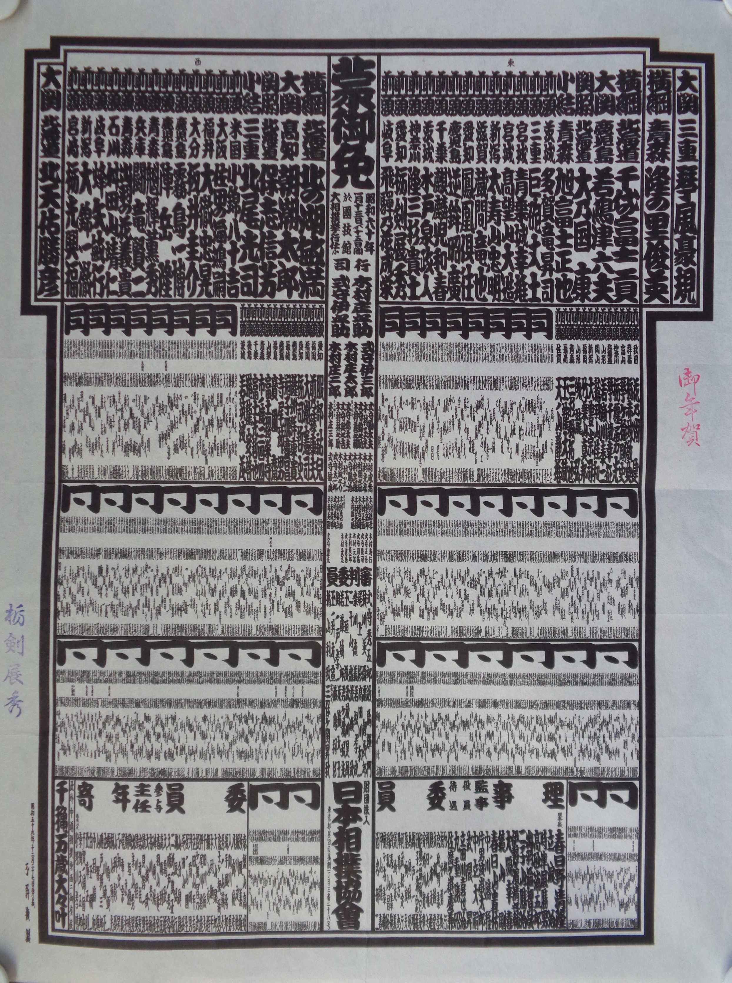
@mwichary There aren’t as many typefaces for Japanese as there are for the Latin alphabet, for obvious reasons, but there is of course a strong tradition of hand-lettering. There’s one particular lettering style called futomoji (literally “fat letters”) that traditionally is only used on sumo posters. Here’s an example of a sumo rankings table: https://www.kosho.or.jp/upload/save_image/26020250/20210924170531519305_30fd1f9fe4a0b34c207b0216c368c01e.jpg
-
I was hoping for your help with something.
Is there a particular font that’s instantly recognizable to someone who lives where you do, and appreciated/recognized/hated there, but completely unknown elsewhere? Something on road signs, street names, transit, infrastructure, stuff like that? I’ll share some examples in the thread.
I’d love to learn more about these. I’m not afraid of links in languages I don’t understand, ha.
(Also please repost for reach if you are willing!)
Thank you!
@mwichary These old Yosemite trail signs cut out of steel are pretty distinctive. They're maybe found in other older US National Parks, not sure.
-
I was hoping for your help with something.
Is there a particular font that’s instantly recognizable to someone who lives where you do, and appreciated/recognized/hated there, but completely unknown elsewhere? Something on road signs, street names, transit, infrastructure, stuff like that? I’ll share some examples in the thread.
I’d love to learn more about these. I’m not afraid of links in languages I don’t understand, ha.
(Also please repost for reach if you are willing!)
Thank you!
@mwichary
The street name font for the sidewalk tiles in New Orleans.
https://www.atlasobscura.com/places/street-name-tiles-of-new-orleans -
@se_davidobrien TIL Reith Sans!
It’s based on Gill Sans, I think, with a bit of tweaking for screens.
It eases readability on the website.
It’s the default font so probably seen by hundreds of millions of people every day.
There’s a serif version too.
-
@mwichary
The street name font for the sidewalk tiles in New Orleans.
https://www.atlasobscura.com/places/street-name-tiles-of-new-orleans@valentine Thank you!!!
-
I was hoping for your help with something.
Is there a particular font that’s instantly recognizable to someone who lives where you do, and appreciated/recognized/hated there, but completely unknown elsewhere? Something on road signs, street names, transit, infrastructure, stuff like that? I’ll share some examples in the thread.
I’d love to learn more about these. I’m not afraid of links in languages I don’t understand, ha.
(Also please repost for reach if you are willing!)
Thank you!
@mwichary I do have a soft spot for the sans used on street signs in Berlin, and particularly the distinctive fz-ligature eszett. Modernism meets topographical history.
-
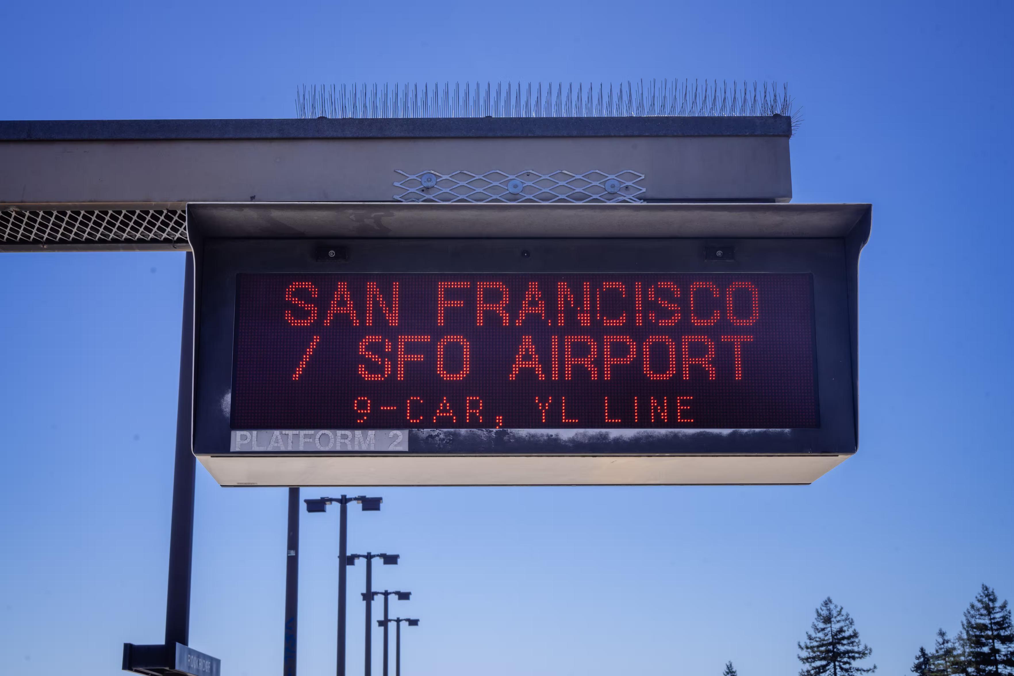
5.
Anyone traveling by BART in California’s Bay Area will instantly recognize these two classic fonts used in this distinctive way.@mwichary Rockridge station? That looks like the view from Rockridge

-
@aschmitz That’s interesting since I live here, but didn’t notice it? Do you have a go to example or two?
@mwichary I don't have any specific ones that come to mind, but I could swear it was pretty common downtown. Maybe I'm mostly thinking of PSAs on those animated billboards in the Loop? Which would be mostly city-generated, presumably. But I could swear I've seen it on various signs walking around, too. (Mostly because shouty narrowish fonts with oversized ink traps seem to be "in" these days, so maybe I've mentally lumped it in with something else too.)
-
@mwichary
The street name font for the sidewalk tiles in New Orleans.
https://www.atlasobscura.com/places/street-name-tiles-of-new-orleans@mwichary
Famous enough to where a local company makes refrigerator alphabet tile sets.
https://dirtycoast.com/products/new-orleans-street-tiles-magnet-set?srsltid=AfmBOoqg7dfFPNfaajUcE1w5FbJ8nAOQe9M2YgiXvuLIO7a7DEp797Zn -
@mwichary
Famous enough to where a local company makes refrigerator alphabet tile sets.
https://dirtycoast.com/products/new-orleans-street-tiles-magnet-set?srsltid=AfmBOoqg7dfFPNfaajUcE1w5FbJ8nAOQe9M2YgiXvuLIO7a7DEp797Zn@valentine That’s cute!
-
@mwichary I don't have any specific ones that come to mind, but I could swear it was pretty common downtown. Maybe I'm mostly thinking of PSAs on those animated billboards in the Loop? Which would be mostly city-generated, presumably. But I could swear I've seen it on various signs walking around, too. (Mostly because shouty narrowish fonts with oversized ink traps seem to be "in" these days, so maybe I've mentally lumped it in with something else too.)
@mwichary Then again, Claude seems to generate it sometimes, so maybe it's just that I'm in Chicagoland and seeing it a lot from that but it's not actually Chicago-specific.
-
@se_davidobrien @mwichary Transport is also used on https://www.gov.uk/ and one of the reasons that site is so good (not always in terms of content, of course).
Well, yes. One of the #GDS mantras was not to research the hell out of stuff you already know.
And we *know* Transport is very legible. There’s 60 or 70 years of research.
-
I was hoping for your help with something.
Is there a particular font that’s instantly recognizable to someone who lives where you do, and appreciated/recognized/hated there, but completely unknown elsewhere? Something on road signs, street names, transit, infrastructure, stuff like that? I’ll share some examples in the thread.
I’d love to learn more about these. I’m not afraid of links in languages I don’t understand, ha.
(Also please repost for reach if you are willing!)
Thank you!
@mwichary Maine town line signs have a distinctive font. My friend catalogued an example of each letter, had a font designer generate a font, and made some of his own.
Unfortunately his site doesn't seem to be up any longer, so I'd have to contact him personally to get the font, can do if it's super interesting to you. He runs a farm now instead of programming
-
@mwichary Maine town line signs have a distinctive font. My friend catalogued an example of each letter, had a font designer generate a font, and made some of his own.
Unfortunately his site doesn't seem to be up any longer, so I'd have to contact him personally to get the font, can do if it's super interesting to you. He runs a farm now instead of programming
@mwichary Massachusetts also has a distinctive town line sign, but I know less about it
-
I was hoping for your help with something.
Is there a particular font that’s instantly recognizable to someone who lives where you do, and appreciated/recognized/hated there, but completely unknown elsewhere? Something on road signs, street names, transit, infrastructure, stuff like that? I’ll share some examples in the thread.
I’d love to learn more about these. I’m not afraid of links in languages I don’t understand, ha.
(Also please repost for reach if you are willing!)
Thank you!
@mwichary Recently, I was intrigued by the font on the Uruguay 2026 World Cup jerseys. It seems it may be inspired by a sign on the Estadio Centenario in Montevideo [1,2,3].
[1] https://x.com/UruguayFootENG/status/2036422367522562322?lang=en
[2] https://outsidewrite.substack.com/p/iconic-football-stadiums-estadio
[3] https://www.threads.com/@footyfont/post/DWcM0e3DFe2/new-update-uruguay-font-world-cup-home-kit-link-product -
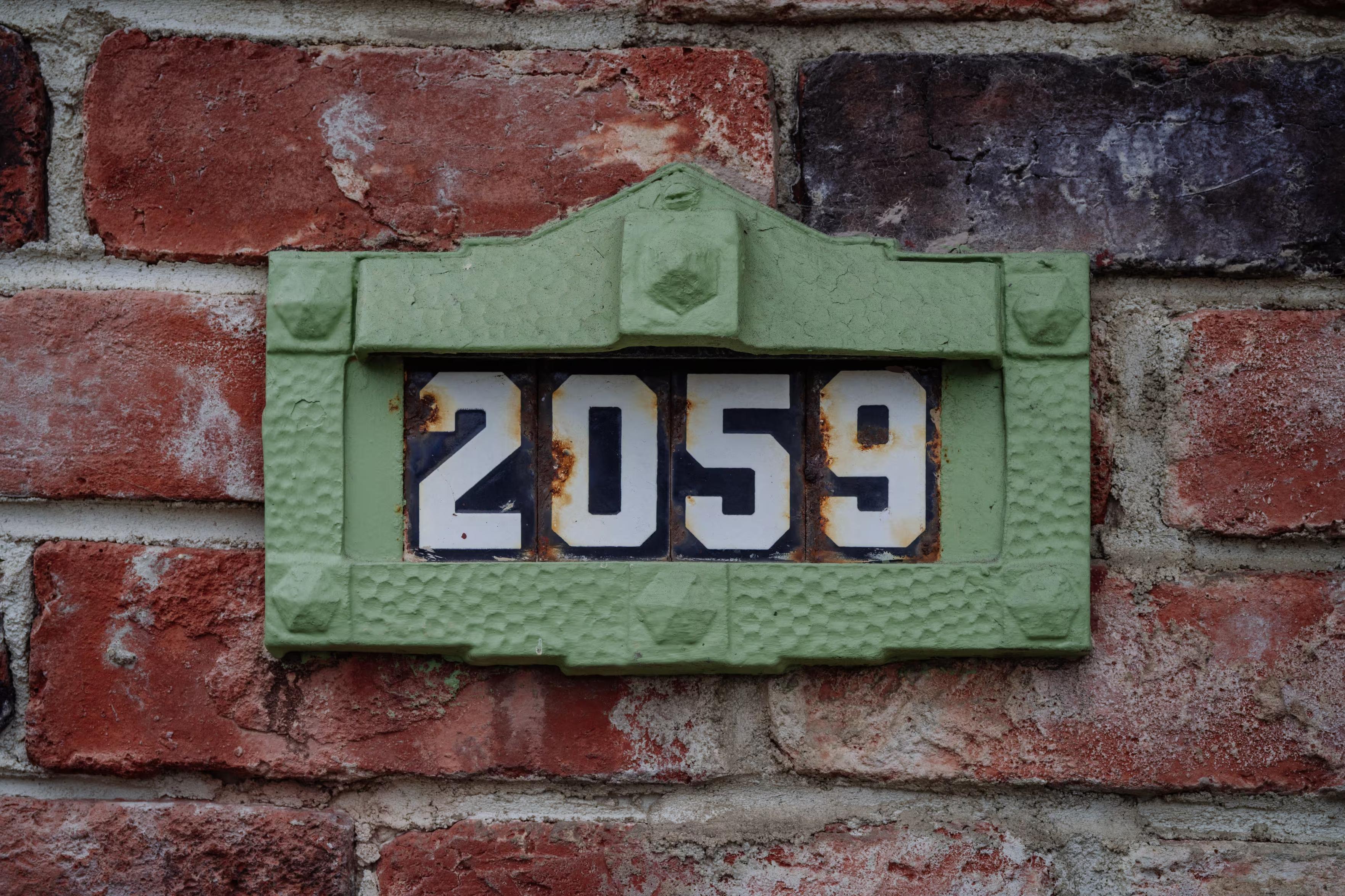
9.
I linked to this a while back – more quirky enamel house numbers in the Netherlands.10.
A pixel font from the NYC Times Square news ticker, 1990s–2000s. (It’s possible this was more of a generic font used elsewhere, but I think it came to be associated with this specific place, time, and purpose.)