is it a good sign when the national weather service runs out of pre-assigned colors to depict temperature?
-
So far, scared.
-
is it a good sign when the national weather service runs out of pre-assigned colors to depict temperature?
@dirkhh ah yes:
Blue = cool
Yellow = warm
Red = hot
Grey = ahhhhhh, I am burning 🥵, why the fuck did I go outside. -
is it a good sign when the national weather service runs out of pre-assigned colors to depict temperature?
From a distant perspective: yes. Because there is now an obvious reason to do something that this doesn’t happen again.
-
is it a good sign when the national weather service runs out of pre-assigned colors to depict temperature?
@dirkhh
 That looks like death in the middle.
 -
is it a good sign when the national weather service runs out of pre-assigned colors to depict temperature?
@dirkhh are they trying to show infrared?
-
is it a good sign when the national weather service runs out of pre-assigned colors to depict temperature?
@dirkhh They have more colors there but you can’t see them because they’re in the infrared part of the spectrum
-
is it a good sign when the national weather service runs out of pre-assigned colors to depict temperature?
@dirkhh we sotheners can now call you laidbacks and criticize your supposed midday nap habits? https://amp.dw.com/en/climate-change-heat-wave-costs-the-german-economy-billions/a-77694558
-
I hear you. As I said, there are fairly simple limits to what A/C can do.
But with the difficult choice of "promote the essential-to-humanity unlimited growth of AI data centers" and "do the absolute bare minimum to try and slow down climate change", it's obvious that a well bought politician needs to accept option 1...
@dirkhh @etchedpixels Pfft, whatever A/C’s restaurants in the US south use could handle it. When you roll up to the parking lot and the windows are all fogged and dripping with condensation, you know you need to go back home to get your parka.
-
is it a good sign when the national weather service runs out of pre-assigned colors to depict temperature?
@dirkhh now exploring different shades of black
-
is it a good sign when the national weather service runs out of pre-assigned colors to depict temperature?
@dirkhh burnt ashes. how appropriate.
-
@dirkhh we sotheners can now call you laidbacks and criticize your supposed midday nap habits? https://amp.dw.com/en/climate-change-heat-wave-costs-the-german-economy-billions/a-77694558
Maybe if conservative politicians see the correlation between climate change and economic stagnation they will finally take it seriously.
-
is it a good sign when the national weather service runs out of pre-assigned colors to depict temperature?
@dirkhh Oh, there's another color there, it's just in infrared
-
is it a good sign when the national weather service runs out of pre-assigned colors to depict temperature?
@dirkhh frogs are smarter.
-
@dirkhh
That looks like death in the middle.@kimlockhartga @dirkhh Well . . .
-
is it a good sign when the national weather service runs out of pre-assigned colors to depict temperature?
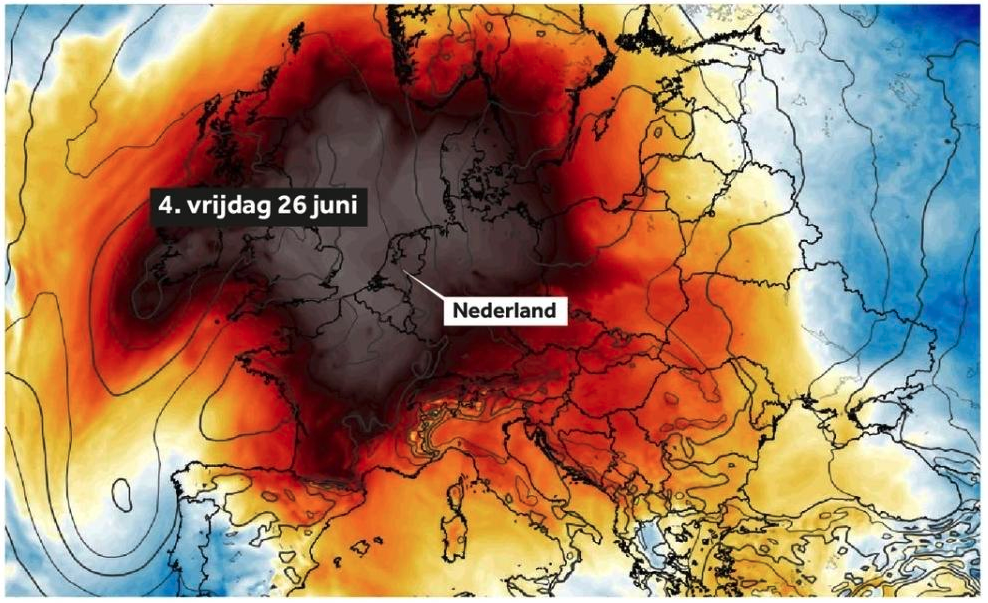
@dirkhh this can't be temp colour coded though. Ireland has been nowhere near as hot as France, and its not winter in Portugal as far as I've heard. What is this?
-
@dirkhh and look at the north, this will be horrible in Greenland even!
@energisch_ @dirkhh Greenland isn't anywhere near this map.
-
@dirkhh, what's the temperature scale for that? (It looks a bit off to me as I'm just about within the grey area but the forecast for tomorrow says 26℃.)
@lp0_on_fire @dirkhh right? Somethings fucky here. Don't get me wrong, I'm hot and it's a climate disaster, but I don't know what this map is telling us.
-
@dirkhh this can't be temp colour coded though. Ireland has been nowhere near as hot as France, and its not winter in Portugal as far as I've heard. What is this?
@Iwillyeah
I think the color depicts the deviation from "average late June temperature". So warmer than usual most places, and colder than usual for example in Portugal... -
is it a good sign when the national weather service runs out of pre-assigned colors to depict temperature?
@dirkhh it's doubleplusgood.
-
@lp0_on_fire @dirkhh right? Somethings fucky here. Don't get me wrong, I'm hot and it's a climate disaster, but I don't know what this map is telling us.
I believe it's the difference compared to the average temperature.