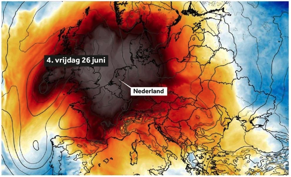
is it a good sign when the national weather service runs out of pre-assigned colors to depict temperature?
-
is it a good sign when the national weather service runs out of pre-assigned colors to depict temperature?
@dirkhh I'm guessing that's infrared then!
(Since hot and cold colours are opposite order of high and low energy light.)
-
is it a good sign when the national weather service runs out of pre-assigned colors to depict temperature?
@dirkhh How hot is that…

-
@Iwillyeah
I think the color depicts the deviation from "average late June temperature". So warmer than usual most places, and colder than usual for example in Portugal...@dirkhh that makes some more sense than an actual heat map
-
is it a good sign when the national weather service runs out of pre-assigned colors to depict temperature?
-
is it a good sign when the national weather service runs out of pre-assigned colors to depict temperature?
@dirkhh It's OK because all the reply-people in the social media comments of news outlets say it's just an ordinary summer (fun fact, it's not summer yet) and stop complaining because it's an ordinary workday for them tomorrow.
…
And other reasons why democracy sometimes frightens me (even if it's still better than the alternatives).
-
@dirkhh we need a version of this pic but the center is burned through.
-
That is incredibly well done.
Can I ask about the toolchain used? It looks amazing. -
is it a good sign when the national weather service runs out of pre-assigned colors to depict temperature?
@dirkhh It means you're in Oklahoma. Sorry.
-
is it a good sign when the national weather service runs out of pre-assigned colors to depict temperature?
@dirkhh there's a color map specifically designed for that use case in Matplotlib. It's called inferno...
https://matplotlib.org/stable/users/explain/colors/colormaps.html#sequential
-
is it a good sign when the national weather service runs out of pre-assigned colors to depict temperature?
-
@energisch_ @dirkhh Greenland isn't anywhere near this map.
@Iwillyeah @energisch_ @dirkhh Grønland is though.
-
@energisch_ @dirkhh Greenland isn't anywhere near this map.
RE: https://fediscience.org/@ZLabe/116812225347353347
@Iwillyeah @dirkhh look at this Arctic ocean heat map https://troet.cafe/@ZLabe@fediscience.org/116812225910301059
-
is it a good sign when the national weather service runs out of pre-assigned colors to depict temperature?
@dirkhh@social.afront.org well, there is #44403d - Scorched Earth color
-
 J jwcph@helvede.net shared this topic