I was hoping for your help with something.
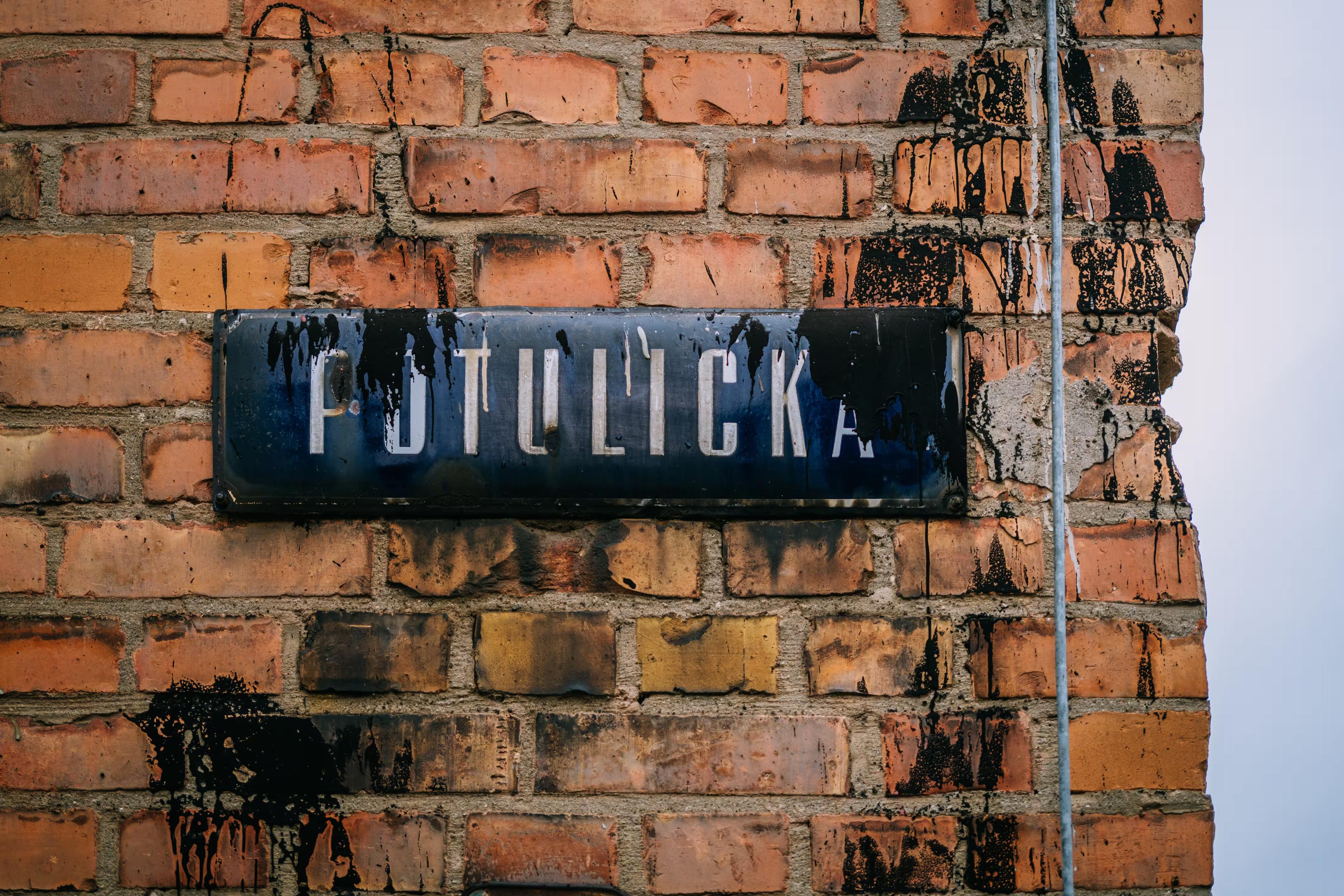
-
@mwichary there's the house face of the TTC subway in Toronto which is similar but different than Johnston Sans
@secretasianman @mwichary was just about to mention this, glad I'm not the only one!
-
@Wintermute_BBS Are you nominating the above, the below, or the combination of both?

-
@secretasianman @mwichary was just about to mention this, glad I'm not the only one!
@dried @secretasianman It’s the best. Do we still not know who designed it?
-
I was hoping for your help with something.
Is there a particular font that’s instantly recognizable to someone who lives where you do, and appreciated/recognized/hated there, but completely unknown elsewhere? Something on road signs, street names, transit, infrastructure, stuff like that? I’ll share some examples in the thread.
I’d love to learn more about these. I’m not afraid of links in languages I don’t understand, ha.
(Also please repost for reach if you are willing!)
Thank you!
Metron by Jiří Rathouský (1973), Prague Metro, Czechia. Digitized by František Štorm.
-
@mwichary Traffic sign typeface guidelines for Finland, written in Finnish language:
https://www.traficom.fi/files/media/file/Liite_11_Liikenne-_ja_viestint%C3%A4viraston_tieliikennemerkkien_kirjasintyypin_mitoitus.pdf (PDF file)Traffic signs of Finland in printable vector file formats:
https://kuvapankki.traficom.fi/en/album/8865@autiomaa Thanks! How is it seen inside Finland, if you know?
-
@mwichary I feel like Gill Sans is _very_ much of London, but that might be too obvious. https://en.wikipedia.org/wiki/Gill_Sans
@pete Well…
(This is East Germany.)
-
5.
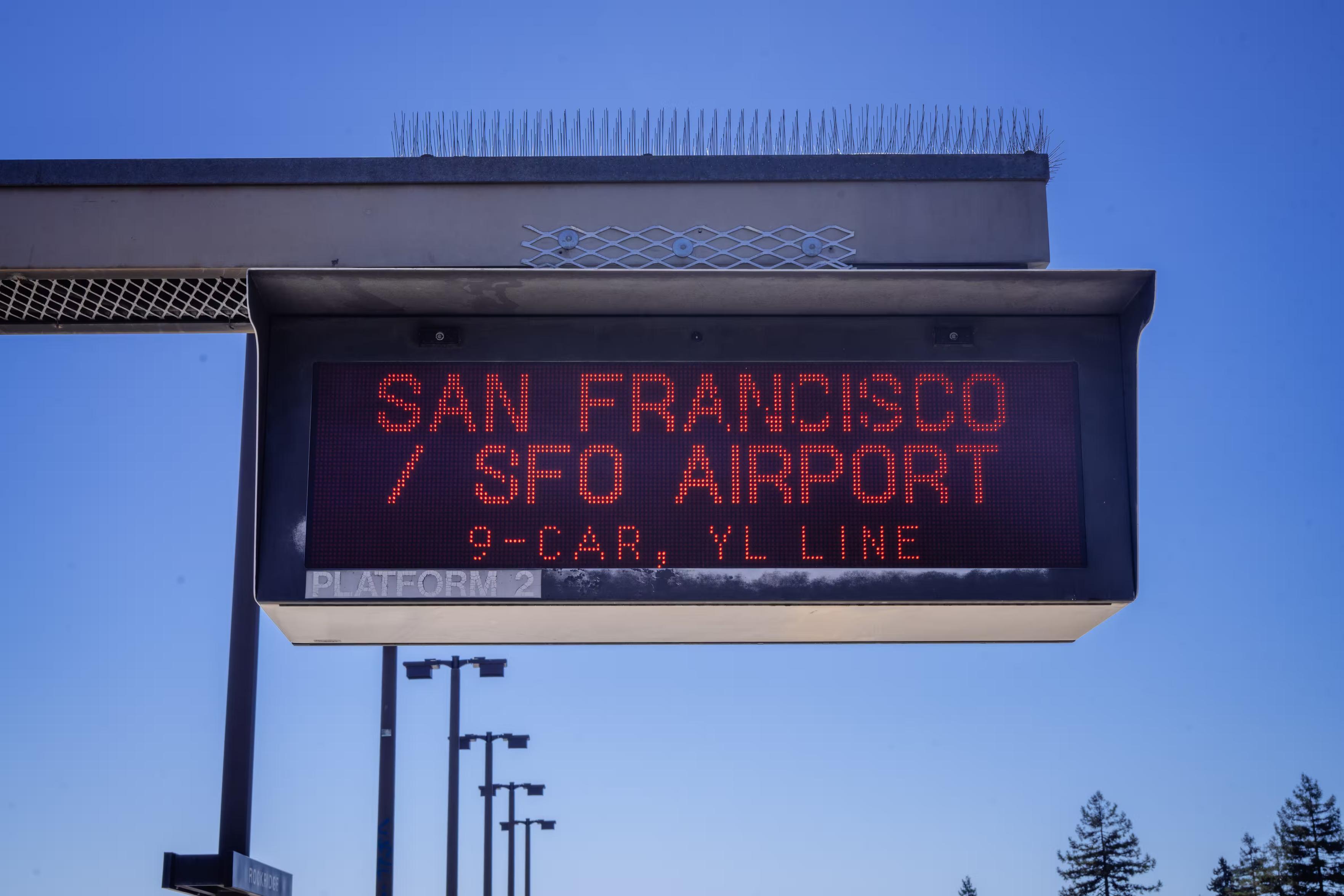
Anyone traveling by BART in California’s Bay Area will instantly recognize these two classic fonts used in this distinctive way.6.
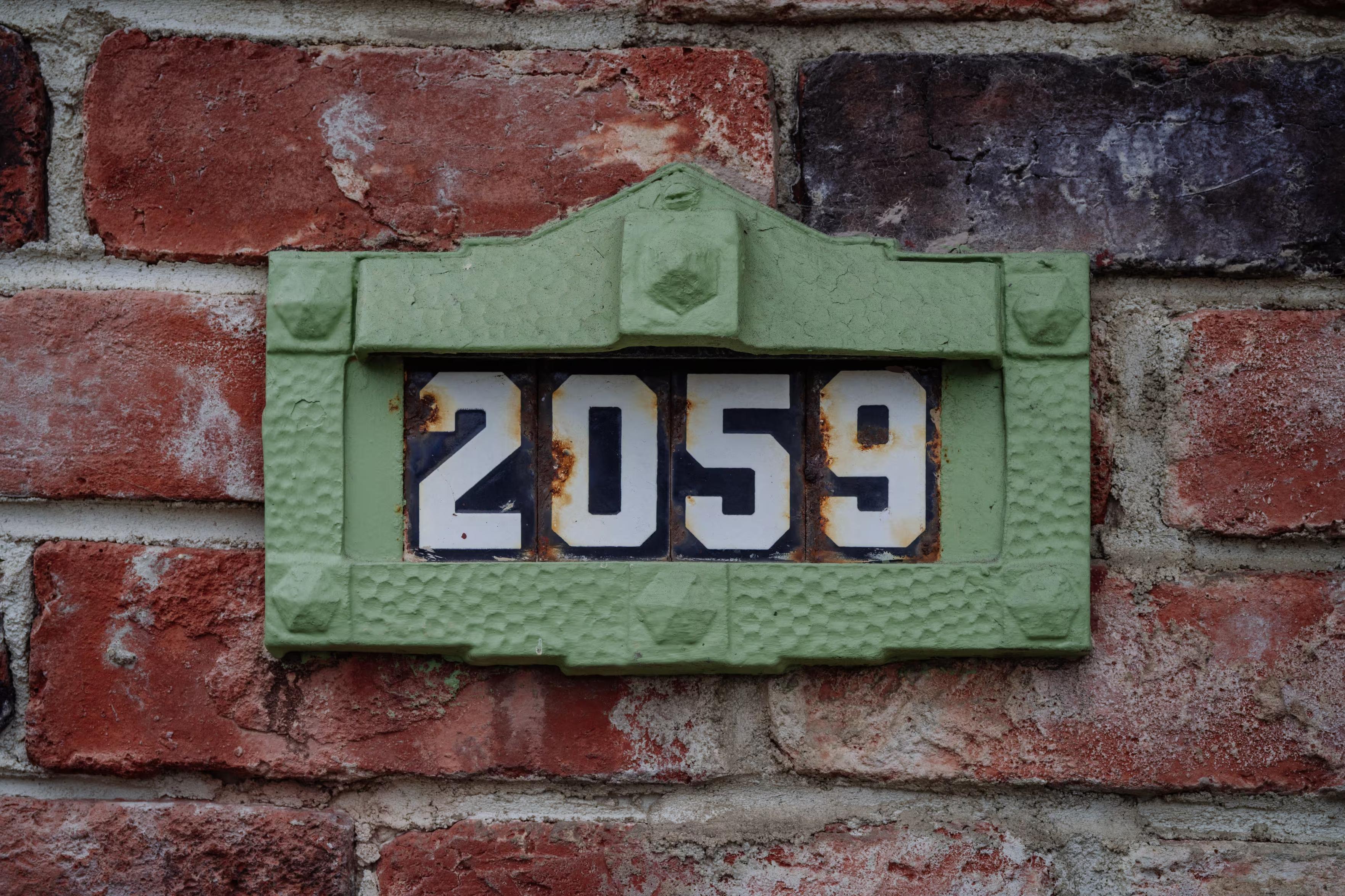
Also in San Francisco, there are these classic distinctive house numbers.The story is here if you are curious: https://sunnysidehistory.org/2020/07/15/the-little-sculpture-affixed-your-house-anton-fazekas/
-
I was hoping for your help with something.
Is there a particular font that’s instantly recognizable to someone who lives where you do, and appreciated/recognized/hated there, but completely unknown elsewhere? Something on road signs, street names, transit, infrastructure, stuff like that? I’ll share some examples in the thread.
I’d love to learn more about these. I’m not afraid of links in languages I don’t understand, ha.
(Also please repost for reach if you are willing!)
Thank you!
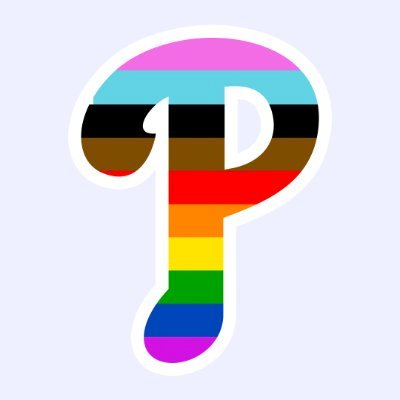
@mwichary The names and numbers on the backs of Phillies jerseys are a custom rounded sans-serif font that's instantly recognizable by anyone from the region. (The front logo is a revamp of the Phillies logo from the 1950s, and this has been the style since 1992.)
Incidentally, Major League Baseball has a photo gallery of all the Phils uniforms going back to 1899. The 1970s-80s look is also iconic, but the back font wasn't nearly as distinctive as the logo.
https://www.mlb.com/phillies/history/uniformsI'm not showing the City Connect uniforms that were introduced last year because fans as well as haters think the typeface is revolting.
-
@mwichary The names and numbers on the backs of Phillies jerseys are a custom rounded sans-serif font that's instantly recognizable by anyone from the region. (The front logo is a revamp of the Phillies logo from the 1950s, and this has been the style since 1992.)
Incidentally, Major League Baseball has a photo gallery of all the Phils uniforms going back to 1899. The 1970s-80s look is also iconic, but the back font wasn't nearly as distinctive as the logo.
https://www.mlb.com/phillies/history/uniformsI'm not showing the City Connect uniforms that were introduced last year because fans as well as haters think the typeface is revolting.
@linuxandyarn What a great example.
-
@mwichary Something else led me to these crib sheets for geoguessr which may be of use/interest: https://www.plonkit.net
@rmartinnielsen Ooh, that’s very clever.
-
I was hoping for your help with something.
Is there a particular font that’s instantly recognizable to someone who lives where you do, and appreciated/recognized/hated there, but completely unknown elsewhere? Something on road signs, street names, transit, infrastructure, stuff like that? I’ll share some examples in the thread.
I’d love to learn more about these. I’m not afraid of links in languages I don’t understand, ha.
(Also please repost for reach if you are willing!)
Thank you!
@mwichary
For the first one I don't know the font name, but I see its usage in the historical part of the Montevideo - Ciudad Vieja (The Old City), see the example in the attached media.For the modern applications, the local government ordered to design the Ciudadana - https://fd.ort.edu.uy/novedades/ciudadana-tipografia-montevideo-120148
https://tipotype.com/ciudadana/ -
@autiomaa Thanks! How is it seen inside Finland, if you know?
@mwichary As a Finnish person, those signs are everywhere around the cities and roads. As a typeface it is not that much liked, but it is readable.
Street signs have different typeface that has a bit more nicer feeling, but the reading distance is smaller for those, so typeface details can look more beautiful (compared to traffic signs).
-
@mwichary The Cambridge Tile Company address tiles used in Milwaukee and Portland.
These are repros, as the originals haven't been made in decades:
https://shop.historicmilwaukee.org/products/milwaukee-address-tiles-brackets@scruss Jinx!
-
@mwichary the portland classic ceramic house numbers came to mind https://www.pdxmonthly.com/home-and-real-estate/2021/03/the-relics-of-portland-s-great-renumbering
@atsuzaki Jinx!
-
@dried @secretasianman It’s the best. Do we still not know who designed it?
-
@mwichary my home region has a specific typography that you can find in many places (PDF): https://www.bretagne.bzh/app/uploads/charte_graph_RB_2025_sept_2025_v03.pdf
@brunogirin Very cool, thanks! You don’t happen to have a photo, do you?
-
@Wintermute_BBS Are you nominating the above, the below, or the combination of both?
@mwichary the below as that has been the font used for at least four decades.
The foreign language signs are a later (but quite nice) addition (there are two more: one in the italian quarter and one in the moroccan quarter).
-
@mwichary A sort of a typographical shibboleth, I suppose
@ricci Thanks! You don’t happen to have a photo or a hint on how to find one?
-
@mwichary the below as that has been the font used for at least four decades.
The foreign language signs are a later (but quite nice) addition (there are two more: one in the italian quarter and one in the moroccan quarter).
@Wintermute_BBS Thanks! Yeah, I saw a lot of versions of DIN around when I visited a few months ago. Fascinating. I need to dig deeper into it.
-
I was hoping for your help with something.
Is there a particular font that’s instantly recognizable to someone who lives where you do, and appreciated/recognized/hated there, but completely unknown elsewhere? Something on road signs, street names, transit, infrastructure, stuff like that? I’ll share some examples in the thread.
I’d love to learn more about these. I’m not afraid of links in languages I don’t understand, ha.
(Also please repost for reach if you are willing!)
Thank you!
@mwichary Not used where I live nowadays, but I recently learned about https://en.wikipedia.org/wiki/Rail_Alphabet