Skip to content
  • Hjem
  • Seneste
  • Etiketter
  • Populære
  • Verden
  • Bruger
  • Grupper
Temaer
  • Light
  • Brite
  • Cerulean
  • Cosmo
  • Flatly
  • Journal
  • Litera
  • Lumen
  • Lux
  • Materia
  • Minty
  • Morph
  • Pulse
  • Sandstone
  • Simplex
  • Sketchy
  • Spacelab
  • United
  • Yeti
  • Zephyr
  • Dark
  • Cyborg
  • Darkly
  • Quartz
  • Slate
  • Solar
  • Superhero
  • Vapor

  • Default (No Skin)
  • No Skin
Kollaps
FARVEL BIG TECH
  1. Forside
  2. Ikke-kategoriseret
  3. I was hoping for your help with something.
I was hoping for your help with something.
Planlagt Fastgjort Låst Flyttet Ikke-kategoriseret
142 Indlæg 58 Posters 0 Visninger
  • Ældste til nyeste
  • Nyeste til ældste
  • Most Votes
Svar
  • Svar som emne
Login for at svare
Denne tråd er blevet slettet. Kun brugere med emne behandlings privilegier kan se den.
  • mwichary@mastodon.onlineM mwichary@mastodon.online

    @brunogirin Very cool, thanks! You don’t happen to have a photo, do you?

    brunogirin@mastodon.me.ukB This user is from outside of this forum
    brunogirin@mastodon.me.ukB This user is from outside of this forum
    brunogirin@mastodon.me.uk
    wrote sidst redigeret af
    #46

    @mwichary Ah no because I don't live there anymore but maybe I can try to source one.

    mwichary@mastodon.onlineM 1 Reply Last reply
    0
    • slink@fosstodon.orgS slink@fosstodon.org

      @mwichary Not used where I live nowadays, but I recently learned about https://en.wikipedia.org/wiki/Rail_Alphabet

      mwichary@mastodon.onlineM This user is from outside of this forum
      mwichary@mastodon.onlineM This user is from outside of this forum
      mwichary@mastodon.online
      wrote sidst redigeret af
      #47

      @slink Yes, thanks! Me too.

      digitalreality@mastodon.me.ukD 1 Reply Last reply
      0
      • mwichary@mastodon.onlineM mwichary@mastodon.online

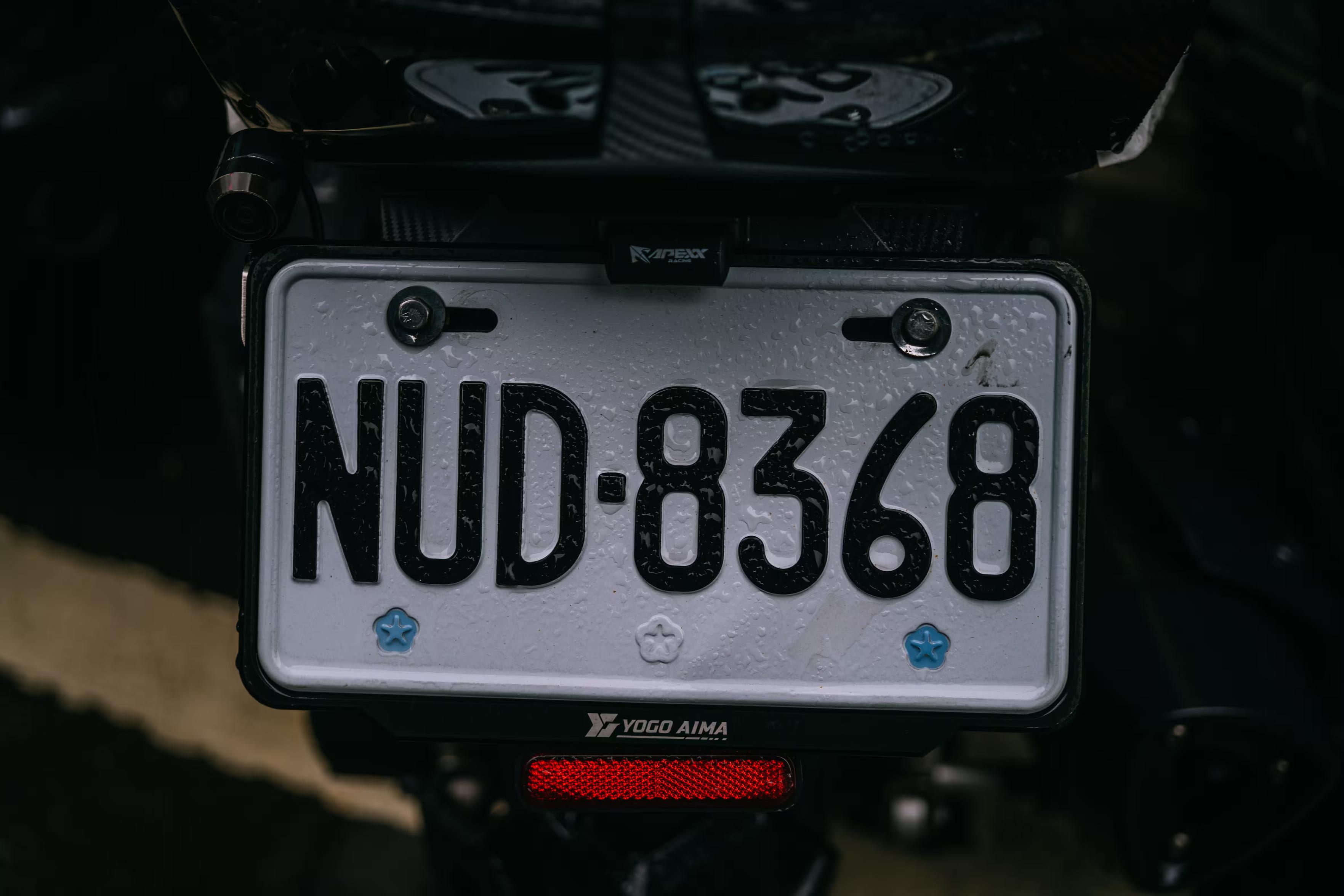
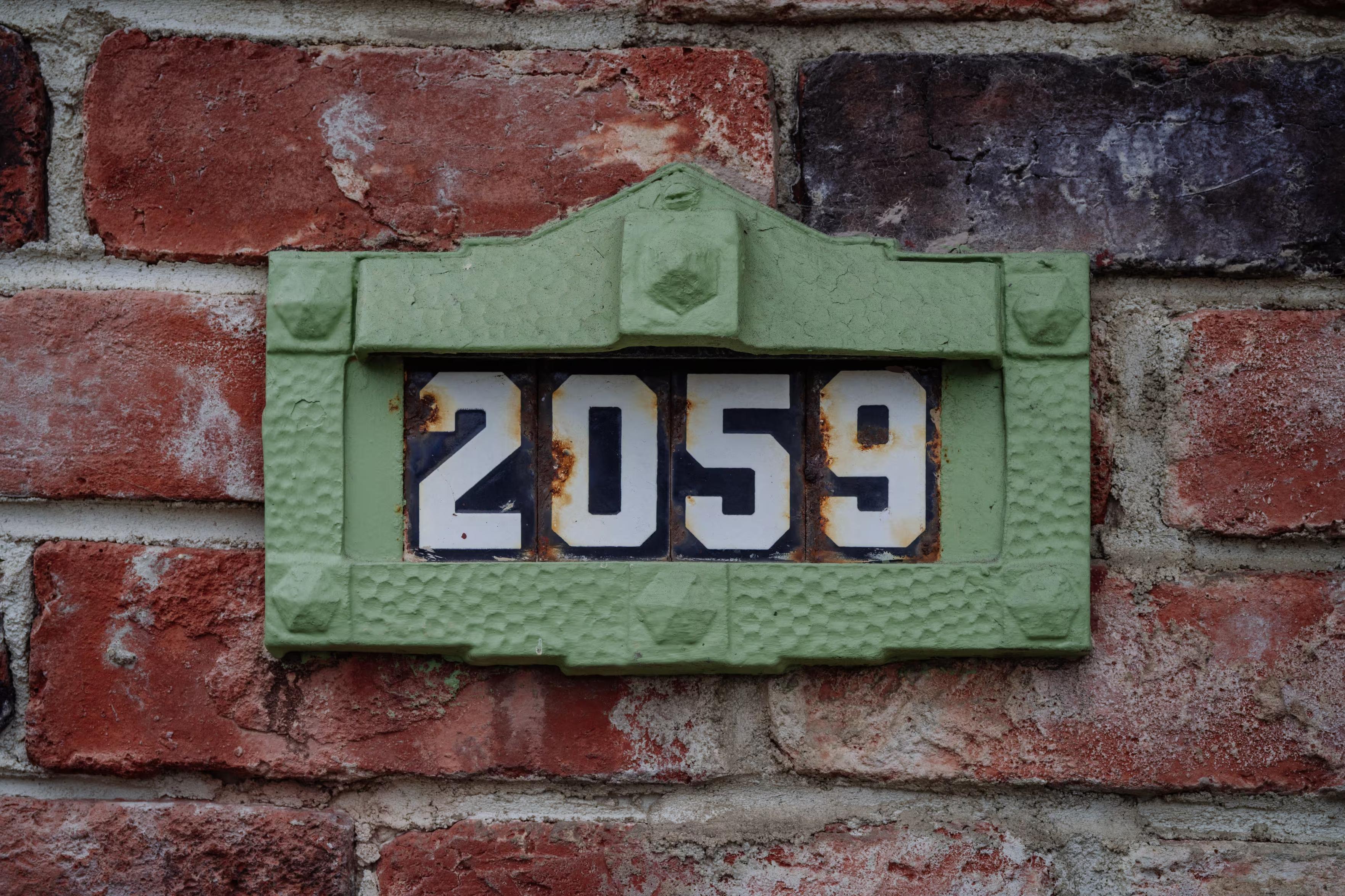
        1.
        In Rotterdam, I spotted this quirky house number font with a very distinctive 3 and 5. I also saw it on some (historical?) license plates.

        sindarina@ngmx.comS This user is from outside of this forum
        sindarina@ngmx.comS This user is from outside of this forum
        sindarina@ngmx.com
        wrote sidst redigeret af
        #48

        @mwichary Dark blue with white letters is indeed historical for Dutch license plates, used only on classic cars that were first registered as new before 1978.

        mwichary@mastodon.onlineM 1 Reply Last reply
        0
        • brunogirin@mastodon.me.ukB brunogirin@mastodon.me.uk

          @mwichary Ah no because I don't live there anymore but maybe I can try to source one.

          mwichary@mastodon.onlineM This user is from outside of this forum
          mwichary@mastodon.onlineM This user is from outside of this forum
          mwichary@mastodon.online
          wrote sidst redigeret af
          #49

          @brunogirin Thanks, it’s not a big thing so please don’t worry too much!

          1 Reply Last reply
          0
          • mwichary@mastodon.onlineM mwichary@mastodon.online

            I was hoping for your help with something.
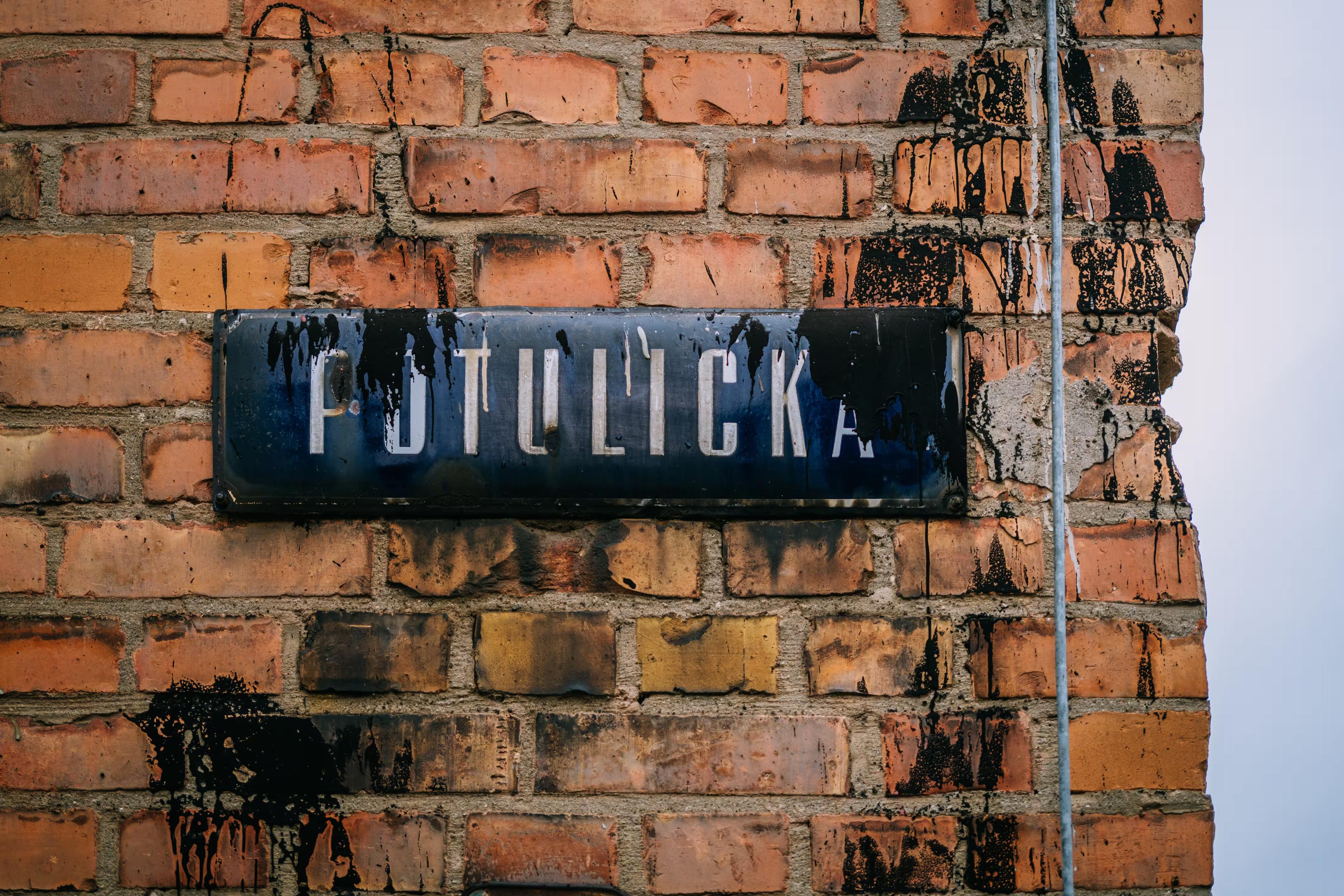
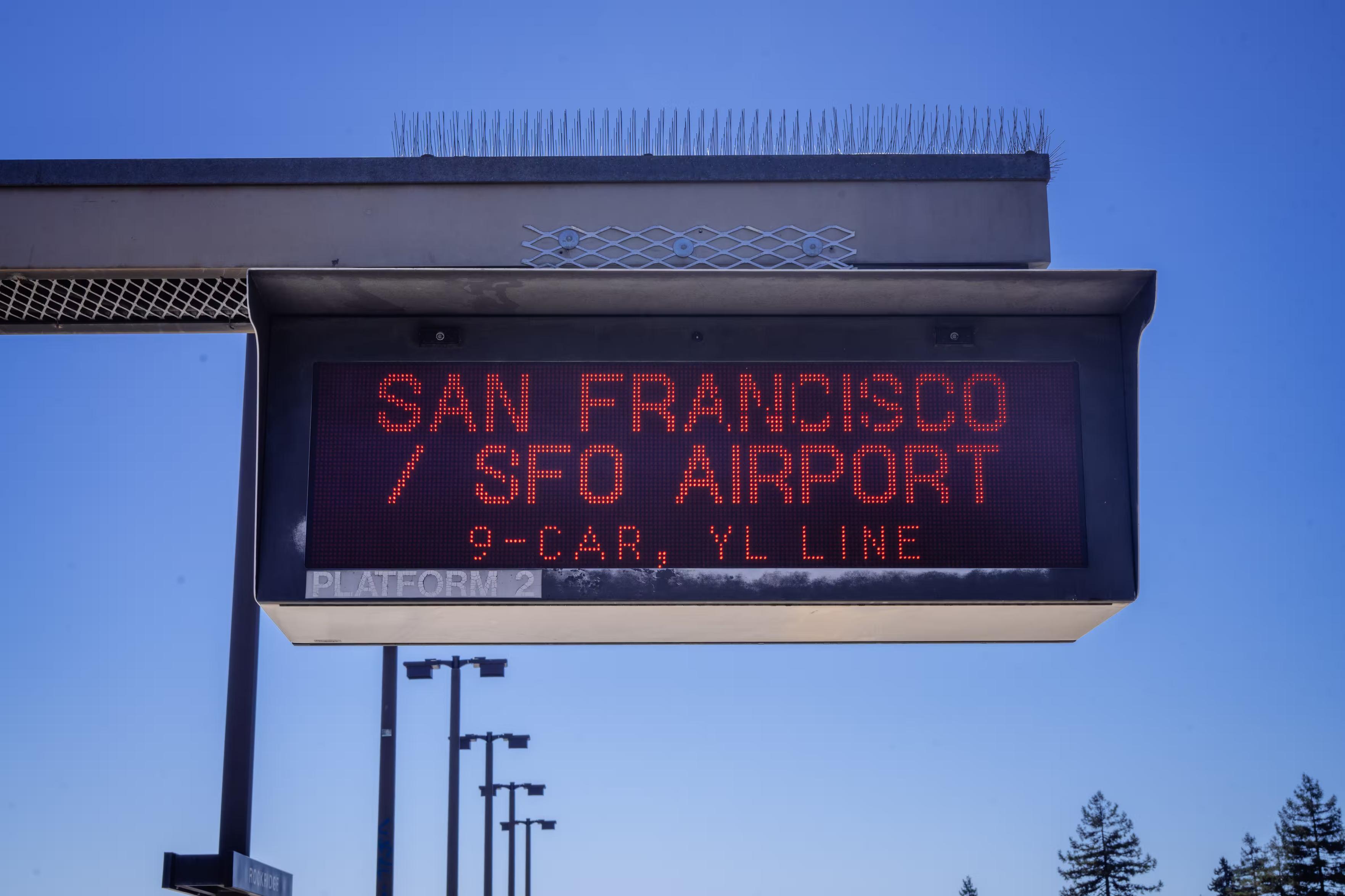
            Is there a particular font that’s instantly recognizable to someone who lives where you do, and appreciated/recognized/hated there, but completely unknown elsewhere? Something on road signs, street names, transit, infrastructure, stuff like that? I’ll share some examples in the thread.

            I’d love to learn more about these. I’m not afraid of links in languages I don’t understand, ha.

            (Also please repost for reach if you are willing!)

            Thank you!

            se_davidobrien@mastodon.scotS This user is from outside of this forum
            se_davidobrien@mastodon.scotS This user is from outside of this forum
            se_davidobrien@mastodon.scot
            wrote sidst redigeret af
            #50

            I'm Scottish. I'd say the two obvious candidate are Transport, the font used on all UK road signs (although the kerning on this example is terrible), and Reith Sans – the house font of https://www.bbc.co.uk/

            @mwichary

            mwichary@mastodon.onlineM pete@social.coopP 2 Replies Last reply
            0
            • mwichary@mastodon.onlineM mwichary@mastodon.online

              I was hoping for your help with something.

              Is there a particular font that’s instantly recognizable to someone who lives where you do, and appreciated/recognized/hated there, but completely unknown elsewhere? Something on road signs, street names, transit, infrastructure, stuff like that? I’ll share some examples in the thread.

              I’d love to learn more about these. I’m not afraid of links in languages I don’t understand, ha.

              (Also please repost for reach if you are willing!)

              Thank you!

              mariejulien@mastodon.socialM This user is from outside of this forum
              mariejulien@mastodon.socialM This user is from outside of this forum
              mariejulien@mastodon.social
              wrote sidst redigeret af
              #51

              @mwichary Parisine in Paris métro.

              mwichary@mastodon.onlineM 1 Reply Last reply
              0
              • mwichary@mastodon.onlineM mwichary@mastodon.online

                1.
                In Rotterdam, I spotted this quirky house number font with a very distinctive 3 and 5. I also saw it on some (historical?) license plates.

                florine@mastodon.greenF This user is from outside of this forum
                florine@mastodon.greenF This user is from outside of this forum
                florine@mastodon.green
                wrote sidst redigeret af
                #52

                @mwichary yep that's the standard house number plate! Very recognisable

                mwichary@mastodon.onlineM 1 Reply Last reply
                0
                • sindarina@ngmx.comS sindarina@ngmx.com

                  @mwichary Dark blue with white letters is indeed historical for Dutch license plates, used only on classic cars that were first registered as new before 1978.

                  mwichary@mastodon.onlineM This user is from outside of this forum
                  mwichary@mastodon.onlineM This user is from outside of this forum
                  mwichary@mastodon.online
                  wrote sidst redigeret af
                  #53

                  @sindarina Yeah, also saw it once more on another old car.

                  1 Reply Last reply
                  0
                  • florine@mastodon.greenF florine@mastodon.green

                    @mwichary yep that's the standard house number plate! Very recognisable

                    mwichary@mastodon.onlineM This user is from outside of this forum
                    mwichary@mastodon.onlineM This user is from outside of this forum
                    mwichary@mastodon.online
                    wrote sidst redigeret af
                    #54

                    @florine Do you know if it’s specific to a region, or all over the country?

                    florine@mastodon.greenF 1 Reply Last reply
                    0
                    • se_davidobrien@mastodon.scotS se_davidobrien@mastodon.scot

                      I'm Scottish. I'd say the two obvious candidate are Transport, the font used on all UK road signs (although the kerning on this example is terrible), and Reith Sans – the house font of https://www.bbc.co.uk/

                      @mwichary

                      mwichary@mastodon.onlineM This user is from outside of this forum
                      mwichary@mastodon.onlineM This user is from outside of this forum
                      mwichary@mastodon.online
                      wrote sidst redigeret af
                      #55

                      @se_davidobrien TIL Reith Sans!

                      se_davidobrien@mastodon.scotS 1 Reply Last reply
                      0
                      • mwichary@mastodon.onlineM mwichary@mastodon.online

                        @brunogirin I think it’s called Transport!

                        scruss@xoxo.zoneS This user is from outside of this forum
                        scruss@xoxo.zoneS This user is from outside of this forum
                        scruss@xoxo.zone
                        wrote sidst redigeret af
                        #56

                        @mwichary @brunogirin but there's also the UK street name font, most recently known as Kindersley Street or Kindersley Grand Arcade — https://wemadethis.co.uk/blog/2022/02/street-name-fonts/

                        (also a product of a fight between two type designers)

                        mwichary@mastodon.onlineM 1 Reply Last reply
                        0
                        • mariejulien@mastodon.socialM mariejulien@mastodon.social

                          @mwichary Parisine in Paris métro.

                          mwichary@mastodon.onlineM This user is from outside of this forum
                          mwichary@mastodon.onlineM This user is from outside of this forum
                          mwichary@mastodon.online
                          wrote sidst redigeret af
                          #57

                          @mariejulien Thanks! Do you know if people love it/hate it/are indifferent/etc.?

                          mariejulien@mastodon.socialM 1 Reply Last reply
                          0
                          • slink@fosstodon.orgS slink@fosstodon.org

                            @mwichary Not used where I live nowadays, but I recently learned about https://en.wikipedia.org/wiki/Rail_Alphabet

                            slink@fosstodon.orgS This user is from outside of this forum
                            slink@fosstodon.orgS This user is from outside of this forum
                            slink@fosstodon.org
                            wrote sidst redigeret af
                            #58

                            @mwichary Nice overview of ze jerman fonts: https://allaboutberlin.com/guides/germany-sign-fonts

                            I just learned that #berlin has its own font

                            mwichary@mastodon.onlineM 1 Reply Last reply
                            0
                            • mwichary@mastodon.onlineM mwichary@mastodon.online

                              I was hoping for your help with something.

                              Is there a particular font that’s instantly recognizable to someone who lives where you do, and appreciated/recognized/hated there, but completely unknown elsewhere? Something on road signs, street names, transit, infrastructure, stuff like that? I’ll share some examples in the thread.

                              I’d love to learn more about these. I’m not afraid of links in languages I don’t understand, ha.

                              (Also please repost for reach if you are willing!)

                              Thank you!

                              joostvb@mastodon.greenJ This user is from outside of this forum
                              joostvb@mastodon.greenJ This user is from outside of this forum
                              joostvb@mastodon.green
                              wrote sidst redigeret af
                              #59

                              @mwichary https://www.mijksenaar.com/project/amsterdam-schiphol-airport/ frutiger (not a free font, unfortunately)

                              mwichary@mastodon.onlineM 1 Reply Last reply
                              0
                              • slink@fosstodon.orgS slink@fosstodon.org

                                @mwichary Nice overview of ze jerman fonts: https://allaboutberlin.com/guides/germany-sign-fonts

                                I just learned that #berlin has its own font

                                mwichary@mastodon.onlineM This user is from outside of this forum
                                mwichary@mastodon.onlineM This user is from outside of this forum
                                mwichary@mastodon.online
                                wrote sidst redigeret af
                                #60

                                @slink Oh, very cool. Thank you.

                                1 Reply Last reply
                                0
                                • joostvb@mastodon.greenJ joostvb@mastodon.green

                                  @mwichary https://www.mijksenaar.com/project/amsterdam-schiphol-airport/ frutiger (not a free font, unfortunately)

                                  mwichary@mastodon.onlineM This user is from outside of this forum
                                  mwichary@mastodon.onlineM This user is from outside of this forum
                                  mwichary@mastodon.online
                                  wrote sidst redigeret af
                                  #61

                                  @joostvb Oh, yeah, classic! Also Dutch railways, right?

                                  joostvb@mastodon.greenJ 1 Reply Last reply
                                  0
                                  • mwichary@mastodon.onlineM mwichary@mastodon.online

                                    @pete Well…

                                    (This is East Germany.)

                                    pete@social.coopP This user is from outside of this forum
                                    pete@social.coopP This user is from outside of this forum
                                    pete@social.coop
                                    wrote sidst redigeret af
                                    #62

                                    @mwichary Yeah, doesn’t fit your criteria but I think Londoners do consider it theirs.

                                    mwichary@mastodon.onlineM 1 Reply Last reply
                                    0
                                    • pete@social.coopP pete@social.coop

                                      @mwichary Yeah, doesn’t fit your criteria but I think Londoners do consider it theirs.

                                      mwichary@mastodon.onlineM This user is from outside of this forum
                                      mwichary@mastodon.onlineM This user is from outside of this forum
                                      mwichary@mastodon.online
                                      wrote sidst redigeret af
                                      #63

                                      @pete Yeah, I was just kidding. Def. super British.

                                      1 Reply Last reply
                                      0
                                      • gemelen@mammut.moeG gemelen@mammut.moe

                                        @mwichary
                                        For the first one I don't know the font name, but I see its usage in the historical part of the Montevideo - Ciudad Vieja (The Old City), see the example in the attached media.

                                        For the modern applications, the local government ordered to design the Ciudadana - https://fd.ort.edu.uy/novedades/ciudadana-tipografia-montevideo-120148
                                        https://tipotype.com/ciudadana/

                                        #Uruguay #Montevideo

                                        mwichary@mastodon.onlineM This user is from outside of this forum
                                        mwichary@mastodon.onlineM This user is from outside of this forum
                                        mwichary@mastodon.online
                                        wrote sidst redigeret af
                                        #64

                                        @gemelen Wow, thanks!

                                        1 Reply Last reply
                                        0
                                        • autiomaa@mementomori.socialA autiomaa@mementomori.social

                                          @mwichary As a Finnish person, those signs are everywhere around the cities and roads. As a typeface it is not that much liked, but it is readable.

                                          Street signs have different typeface that has a bit more nicer feeling, but the reading distance is smaller for those, so typeface details can look more beautiful (compared to traffic signs).

                                          mwichary@mastodon.onlineM This user is from outside of this forum
                                          mwichary@mastodon.onlineM This user is from outside of this forum
                                          mwichary@mastodon.online
                                          wrote sidst redigeret af
                                          #65

                                          @autiomaa Thank you!

                                          1 Reply Last reply
                                          0
                                          Svar
                                          • Svar som emne
                                          Login for at svare
                                          • Ældste til nyeste
                                          • Nyeste til ældste
                                          • Most Votes


                                          • Log ind

                                          • Har du ikke en konto? Tilmeld

                                          • Login or register to search.
                                          Powered by NodeBB Contributors
                                          Graciously hosted by data.coop
                                          • First post
                                            Last post
                                          0
                                          • Hjem
                                          • Seneste
                                          • Etiketter
                                          • Populære
                                          • Verden
                                          • Bruger
                                          • Grupper