📊 This paper by Crameri et al. from 2020 shows why #color choice in figures matters.
-
 This paper by Crameri et al. from 2020 shows why #color choice in figures matters.
Rainbow
 and red–green colormaps
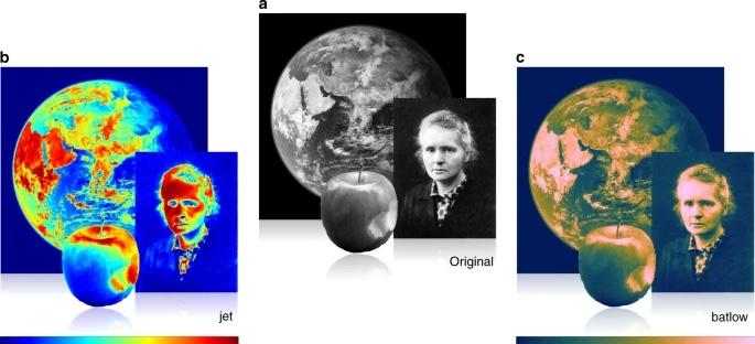
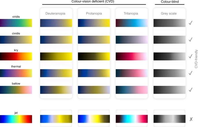
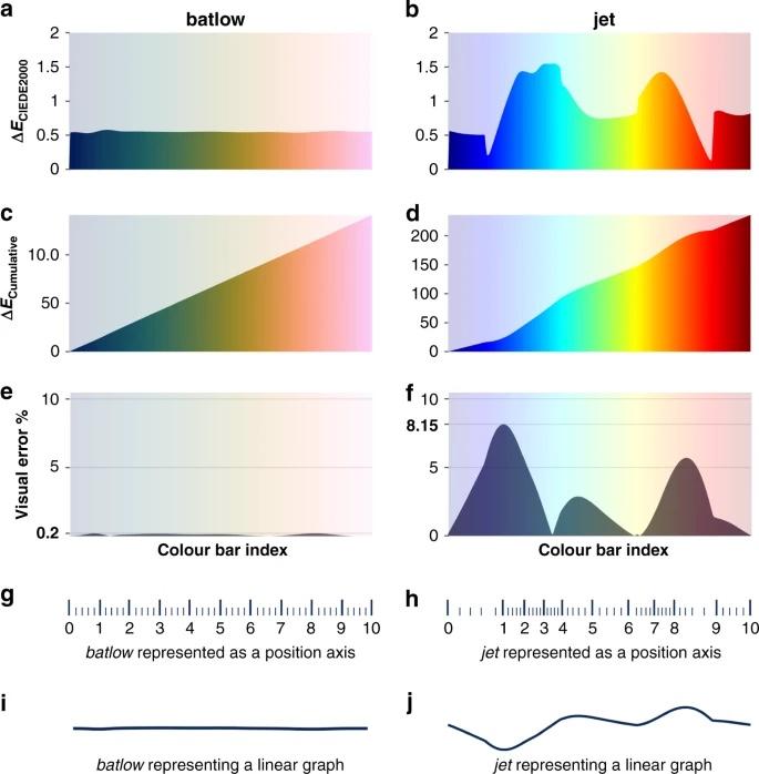
 ️ can distort gradients, create artificial boundaries, and exclude readers with color-vision deficiency. They quantify the visual error and argue for perceptually uniform, #CVD-friendly scientific colormaps instead.
 -
This paper by Crameri et al. from 2020 shows why #color choice in figures matters.
Rainbow
and red–green colormaps ️ can distort gradients, create artificial boundaries, and exclude readers with color-vision deficiency. They quantify the visual error and argue for perceptually uniform, #CVD-friendly scientific colormaps instead. And just found this: 7 #Colorblind-Safe Color Palettes for Scientific Figures. Copy-paste #OkabeIto, #Viridis, Paul Tol & Wong palette #HexCodes. #CVD-friendly palettes recommended by Nature, with side-by-side comparisons and usage examples:
 https://conceptviz.app/blog/scientific-color-palette-for-research-papers-and-posters
 -
This paper by Crameri et al. from 2020 shows why #color choice in figures matters.
Rainbow
and red–green colormaps ️ can distort gradients, create artificial boundaries, and exclude readers with color-vision deficiency. They quantify the visual error and argue for perceptually uniform, #CVD-friendly scientific colormaps instead. @FabMusacchio I always like to link this when explaining why not to use jet / rainbow palettes https://youtu.be/xAoljeRJ3lU?si=m4hWHJP8uT2g2v5I
-
 F folfdk@helvede.net shared this topic
