I just got a shock.
-
-
@NatureMC @MastodonEngineering @Mastodon @staff Taking a look, for me the number one issue is the text being so much smaller by default. Like, I'm not that old, but we shouldn't have to squint or zoom in, surely?
@HaTetsu Exactly.
I just had updated my Firefox and thought that the browser had bugs. But then I saw that all other websites work well. -
I just got a shock. I want the old design back!!!

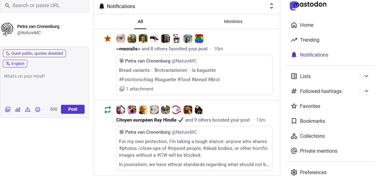
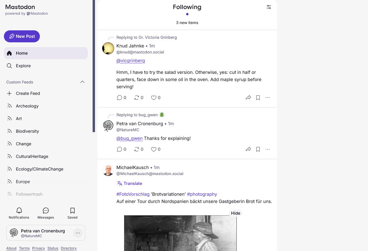
It was a matter of seconds, and the Design of #Mastodon changed.Usually, I have nothing against design changes. But if it hits me so unprepared that I think my browser has a bug ...
A real bug is that I have to make an extra click for writing a post now and get a much too small pop up field down at the right (not at eye's height)! I have to search for notifications ... it's less intuitive than before.Same here. This is not an UI change but a change in functionality. No search box, not using the space on my screen (desktop) or wasting the space on my screen with whitespace (phonebrowser, I only see two posts maximum at a time).
This can't have been tested with a variety of users right? I still wonder whether something simply went wrong.
-
-
I just got a shock. I want the old design back!!!
It was a matter of seconds, and the Design of #Mastodon changed.Usually, I have nothing against design changes. But if it hits me so unprepared that I think my browser has a bug ...
A real bug is that I have to make an extra click for writing a post now and get a much too small pop up field down at the right (not at eye's height)! I have to search for notifications ... it's less intuitive than before.@NatureMC @MastodonEngineering @Mastodon @staff
Same here. Besides being totally non-intuitiv I can't find today's trends which I've activated in the preferences. And to write a new toot I need to click on the "New post" button on the left which opens the edit window on the right of the screen. Who thought this was a great idea? The new UI just looks like a colossal waste of space. -
Same here. This is not an UI change but a change in functionality. No search box, not using the space on my screen (desktop) or wasting the space on my screen with whitespace (phonebrowser, I only see two posts maximum at a time).
This can't have been tested with a variety of users right? I still wonder whether something simply went wrong.
Someone commented it looks like X. That makes me think what this looks like is an attempt to change a social media platform into a broadcasting platform where "big voices" are seen but comments, discussion and minor voices are drawn out.
Simply scrolling down my feed that is the impression you get now.
-
Same here. This is not an UI change but a change in functionality. No search box, not using the space on my screen (desktop) or wasting the space on my screen with whitespace (phonebrowser, I only see two posts maximum at a time).
This can't have been tested with a variety of users right? I still wonder whether something simply went wrong.
@Pepijn Search is now hidden behind Explore (not at all intuitive). I can't edit the alt texts anymore (bug?), I need an extra click "new post" which sends a very small pop up to the right bottom instead of the height of my eyes like before ... everything's smaller, so many flaws ...
I DO HOPE that they'll get a better version. -
@NatureMC @MastodonEngineering @Mastodon @staff
Same here. Besides being totally non-intuitiv I can't find today's trends which I've activated in the preferences. And to write a new toot I need to click on the "New post" button on the left which opens the edit window on the right of the screen. Who thought this was a great idea? The new UI just looks like a colossal waste of space.@NatureMC @MastodonEngineering @Mastodon @staff
Sorry, @NatureMC,for ranting against the UI here in your thread. I'm just in shock and anger.
Besides I had to cut my previous post because the UI kept telling me that using 480 of 500 text characters is just too long .
. -
@NatureMC @MastodonEngineering @Mastodon @staff
Same here. Besides being totally non-intuitiv I can't find today's trends which I've activated in the preferences. And to write a new toot I need to click on the "New post" button on the left which opens the edit window on the right of the screen. Who thought this was a great idea? The new UI just looks like a colossal waste of space.@hhttg This! And yes, the trends are gone ...
-
Someone commented it looks like X. That makes me think what this looks like is an attempt to change a social media platform into a broadcasting platform where "big voices" are seen but comments, discussion and minor voices are drawn out.
Simply scrolling down my feed that is the impression you get now.
@Pepijn I’m starting to lose all interest in using Mastodon. I’m going to spend a bit of time on Bluesky.

-
@LaimesKudikis Yes. And Likes/Boosts with their numbers got more prominent, as if they try to copy the big platforms now.
@NatureMC That's exactly what I thought after getting over the first wave of "what-the-hell-has-happened-here".
-
@Pepijn I’m starting to lose all interest in using Mastodon. I’m going to spend a bit of time on Bluesky.
@NatureMC Hah
 From this update it seems @MastodonEngineering also prefers the not-social model of social-media Bluesky is designed for.
 -
@andijah I hope that they still learn from our feedback.
-
@NatureMC @MastodonEngineering @Mastodon @staff
Sorry, @NatureMC,for ranting against the UI here in your thread. I'm just in shock and anger.
Besides I had to cut my previous post because the UI kept telling me that using 480 of 500 text characters is just too long.@hhttg I rant too, no problem!
Meanwhile I'm so angry: yes, i had the same problem with the character limit, I tried 3 times to post something under 500 characters in vain.
To publish such a slop version ... wait, perhaps it was vibe coding? 🥶 -
@NatureMC Hah
From this update it seems @MastodonEngineering also prefers the not-social model of social-media Bluesky is designed for.@Pepijn I was serious about switching to Bluesky for the rest of the day (I have an account there). It looks better and works well.

-
@hhttg I rant too, no problem!
Meanwhile I'm so angry: yes, i had the same problem with the character limit, I tried 3 times to post something under 500 characters in vain.
To publish such a slop version ... wait, perhaps it was vibe coding? 🥶 -
@NatureMC Hah
From this update it seems @MastodonEngineering also prefers the not-social model of social-media Bluesky is designed for.You are both on mastodon.online. That server runs version "v4.8.0-nightly.2026-10-05", which sounds a little too on-the-edge for a 8K user instance.
Version "v4.7.3" is the latest official release:
-
@NatureMC @MastodonEngineering @Mastodon @staff
Same here. Besides being totally non-intuitiv I can't find today's trends which I've activated in the preferences. And to write a new toot I need to click on the "New post" button on the left which opens the edit window on the right of the screen. Who thought this was a great idea? The new UI just looks like a colossal waste of space.@hhttg @NatureMC @MastodonEngineering @Mastodon @staff …That's odd, the lower-right corner had a smaller button to open the composer in the mockups they showed off a couple months ago
-
You are both on mastodon.online. That server runs version "v4.8.0-nightly.2026-10-05", which sounds a little too on-the-edge for a 8K user instance.
Version "v4.7.3" is the latest official release:
@mjack I know that they test every new version on our instance. Therefore, I rant at once that they see what they did.
They plan it for all .... https://blog.joinmastodon.org/2026/08/5.0-laying-the-foundation/ -
@mjack I know that they test every new version on our instance. Therefore, I rant at once that they see what they did.
They plan it for all .... https://blog.joinmastodon.org/2026/08/5.0-laying-the-foundation/I've never noticed the difference between mastodon.social and mastodon.online before, but if they are using mastodon.online as a test bed, that should be shown prominently on the About page. I don't think:
"A newer server of Mastodon, operated by Mastodon GmbH for the common good"
quite covers it.