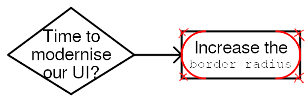
I hope I don't get in trouble for sharing this publicly, but I managed to get my hands on the detailed design docs that everyone is using for their big UI redesigns of late.
-
"But phlip", I hear you ask, "surely if you increase the border radius so far that the rectangles are now capsules, you've increased them as far as they'll go! How can we further modernise in the future if we're already at maximum innovation?"
Ah, ye of little faith. Observe, the future UI uplift of 2029:
@phlip I think this is secretly why Apple tried their Liquid Glass thing.
They couldn't round the corners any further so they tried to hide it.
-
I hope I don't get in trouble for sharing this publicly, but I managed to get my hands on the detailed design docs that everyone is using for their big UI redesigns of late.
@phlip I think we should switch to negative border radius
-
I hope I don't get in trouble for sharing this publicly, but I managed to get my hands on the detailed design docs that everyone is using for their big UI redesigns of late.
@phlip they ran out of colour to remove from icons
-
@phlip currently posting this with css
border-radius: 50% !importanton every element. -
I hope I don't get in trouble for sharing this publicly, but I managed to get my hands on the detailed design docs that everyone is using for their big UI redesigns of late.
@phlip A brief history guide of modern UI design in:
- Late 1980s thru 1990s: Raised and embossed 3D
- 2000s thru early 2010s: Choose your own adventure - shiny plastic or translucent glass
- Mid 2010s: Flat colors with square corners
- Late 2010s: Flat colors with rounded corners
- 2020s: The rounding of the corners will continue until morale improves -
"But phlip", I hear you ask, "surely if you increase the border radius so far that the rectangles are now capsules, you've increased them as far as they'll go! How can we further modernise in the future if we're already at maximum innovation?"
Ah, ye of little faith. Observe, the future UI uplift of 2029:
@phlip This is way too legible to be the UI of the future
-
I hope I don't get in trouble for sharing this publicly, but I managed to get my hands on the detailed design docs that everyone is using for their big UI redesigns of late.
@phlip Oh my god, I hate this, everything is so corporate feeling when it does this. Right angles ftw!
-
"But phlip", I hear you ask, "surely if you increase the border radius so far that the rectangles are now capsules, you've increased them as far as they'll go! How can we further modernise in the future if we're already at maximum innovation?"
Ah, ye of little faith. Observe, the future UI uplift of 2029:
@phlip hotdog-button UI
-
@phlip hotdog-button UI
-
-
"But phlip", I hear you ask, "surely if you increase the border radius so far that the rectangles are now capsules, you've increased them as far as they'll go! How can we further modernise in the future if we're already at maximum innovation?"
Ah, ye of little faith. Observe, the future UI uplift of 2029:
@phlip That's a sausage I don't want to know how it got made. But... it's "AI", isn't it?
-
@phlip also add a multi-colored shadow so people know it has AI
-
I hope I don't get in trouble for sharing this publicly, but I managed to get my hands on the detailed design docs that everyone is using for their big UI redesigns of late.
@phlip the pixel 12 will have circular screens so they can fit more border radius
-
I hope I don't get in trouble for sharing this publicly, but I managed to get my hands on the detailed design docs that everyone is using for their big UI redesigns of late.
@phlip@kind.social and more importantly, increase the padding as well

-
@phlip@kind.social and more importantly, increase the padding as well
@jay0@alico.nexus @phlip@kind.social dont forget redesigning only for mobile so the desktop site has huge amounts of whitespace on the sides
-
@jay0@alico.nexus @phlip@kind.social dont forget redesigning only for mobile so the desktop site has huge amounts of whitespace on the sides
@frawst@fedi.fraw.st @phlip@kind.social and do all drawing pixel per pixel on a js canvas, we need full control of the styling after all, can't trust standards like CSS!
-
I hope I don't get in trouble for sharing this publicly, but I managed to get my hands on the detailed design docs that everyone is using for their big UI redesigns of late.
@phlip AI also loves this btw
-
I hope I don't get in trouble for sharing this publicly, but I managed to get my hands on the detailed design docs that everyone is using for their big UI redesigns of late.
@phlip@kind.social remember when big fonts and rounded corners used to mean "for children"? I guess they're just cathering to the workers of the AI era.
-
I hope I don't get in trouble for sharing this publicly, but I managed to get my hands on the detailed design docs that everyone is using for their big UI redesigns of late.
@phlip yeah. i ended up not hating the firefox redesign as much as i thought i would (mostly because it didn't really change much except add a, actually kinda colour gradient to the UI that actually looks kinda nice after picking a nice purple theme)
but i did have to edit my userChrome.css to make the rounded corners sensible again.
-
I hope I don't get in trouble for sharing this publicly, but I managed to get my hands on the detailed design docs that everyone is using for their big UI redesigns of late.
@phlip lol I remember there was a meme that was like “someone leaked the source code for windows 11” and it’s just border-radius
in retrospect that was kinda unfair to Microsoft, they added a bunch of telemetry and spying stuff too













 ️
️