Skip to content
  • Hjem
  • Seneste
  • Etiketter
  • Populære
  • Verden
  • Bruger
  • Grupper
Temaer
  • Light
  • Brite
  • Cerulean
  • Cosmo
  • Flatly
  • Journal
  • Litera
  • Lumen
  • Lux
  • Materia
  • Minty
  • Morph
  • Pulse
  • Sandstone
  • Simplex
  • Sketchy
  • Spacelab
  • United
  • Yeti
  • Zephyr
  • Dark
  • Cyborg
  • Darkly
  • Quartz
  • Slate
  • Solar
  • Superhero
  • Vapor

  • Default (No Skin)
  • No Skin
Kollaps
FARVEL BIG TECH
  1. Forside
  2. Ikke-kategoriseret
  3. I was hoping for your help with something.
I was hoping for your help with something.
Planlagt Fastgjort Låst Flyttet Ikke-kategoriseret
142 Indlæg 58 Posters 0 Visninger
  • Ældste til nyeste
  • Nyeste til ældste
  • Most Votes
Svar
  • Svar som emne
Login for at svare
Denne tråd er blevet slettet. Kun brugere med emne behandlings privilegier kan se den.
  • llimllib@hachyderm.ioL llimllib@hachyderm.io

    @mwichary Maine town line signs have a distinctive font. My friend catalogued an example of each letter, had a font designer generate a font, and made some of his own.

    Unfortunately his site doesn't seem to be up any longer, so I'd have to contact him personally to get the font, can do if it's super interesting to you. He runs a farm now instead of programming

    llimllib@hachyderm.ioL This user is from outside of this forum
    llimllib@hachyderm.ioL This user is from outside of this forum
    llimllib@hachyderm.io
    wrote sidst redigeret af
    #127

    @mwichary Massachusetts also has a distinctive town line sign, but I know less about it

    mwichary@mastodon.onlineM 1 Reply Last reply
    0
    • mwichary@mastodon.onlineM mwichary@mastodon.online

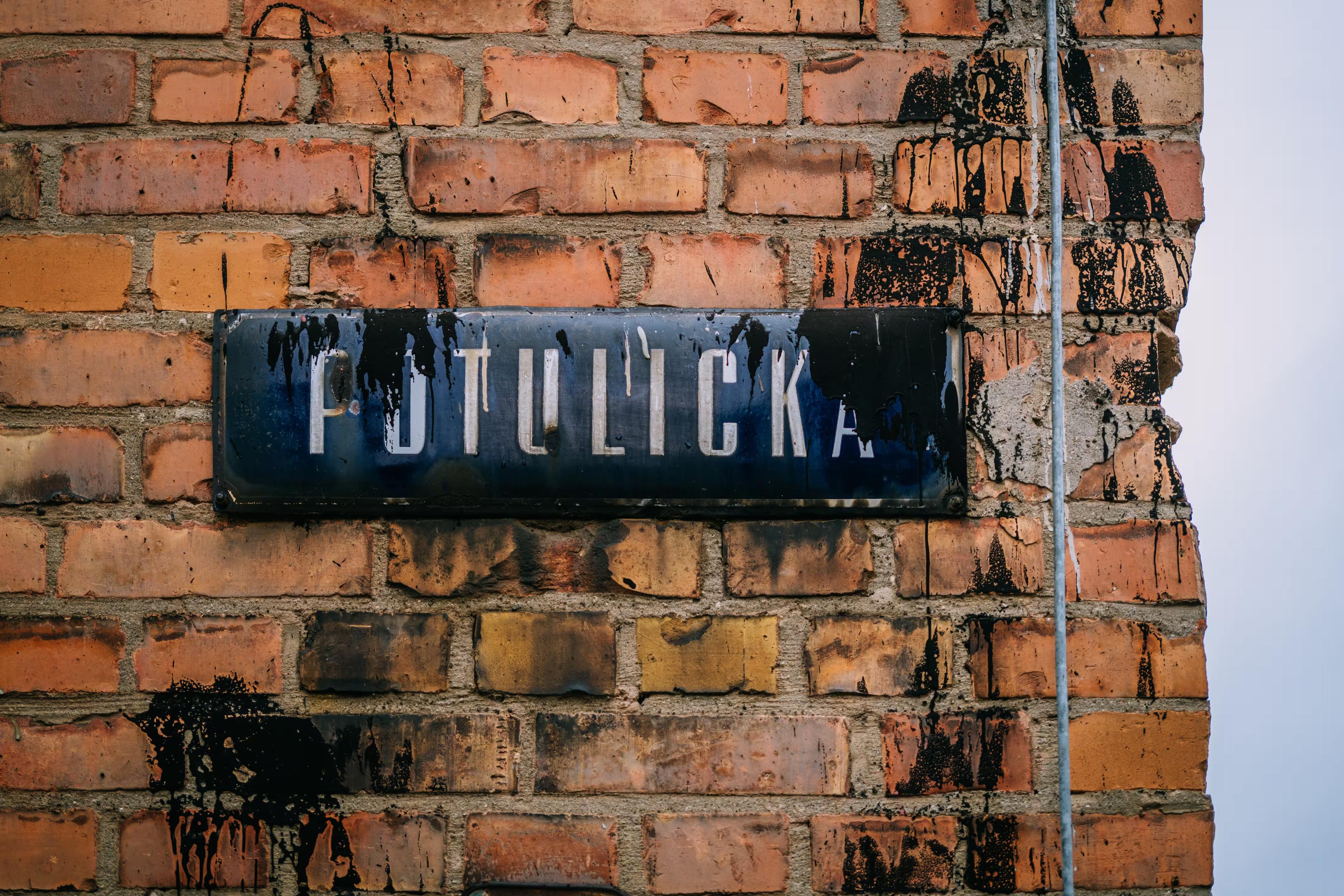
      I was hoping for your help with something.
      Is there a particular font that’s instantly recognizable to someone who lives where you do, and appreciated/recognized/hated there, but completely unknown elsewhere? Something on road signs, street names, transit, infrastructure, stuff like that? I’ll share some examples in the thread.

      I’d love to learn more about these. I’m not afraid of links in languages I don’t understand, ha.

      (Also please repost for reach if you are willing!)

      Thank you!

      jvl@mathstodon.xyzJ This user is from outside of this forum
      jvl@mathstodon.xyzJ This user is from outside of this forum
      jvl@mathstodon.xyz
      wrote sidst redigeret af
      #128

      @mwichary Recently, I was intrigued by the font on the Uruguay 2026 World Cup jerseys. It seems it may be inspired by a sign on the Estadio Centenario in Montevideo [1,2,3].

      [1] https://x.com/UruguayFootENG/status/2036422367522562322?lang=en
      [2] https://outsidewrite.substack.com/p/iconic-football-stadiums-estadio
      [3] https://www.threads.com/@footyfont/post/DWcM0e3DFe2/new-update-uruguay-font-world-cup-home-kit-link-product

      1 Reply Last reply
      0
      • mwichary@mastodon.onlineM mwichary@mastodon.online

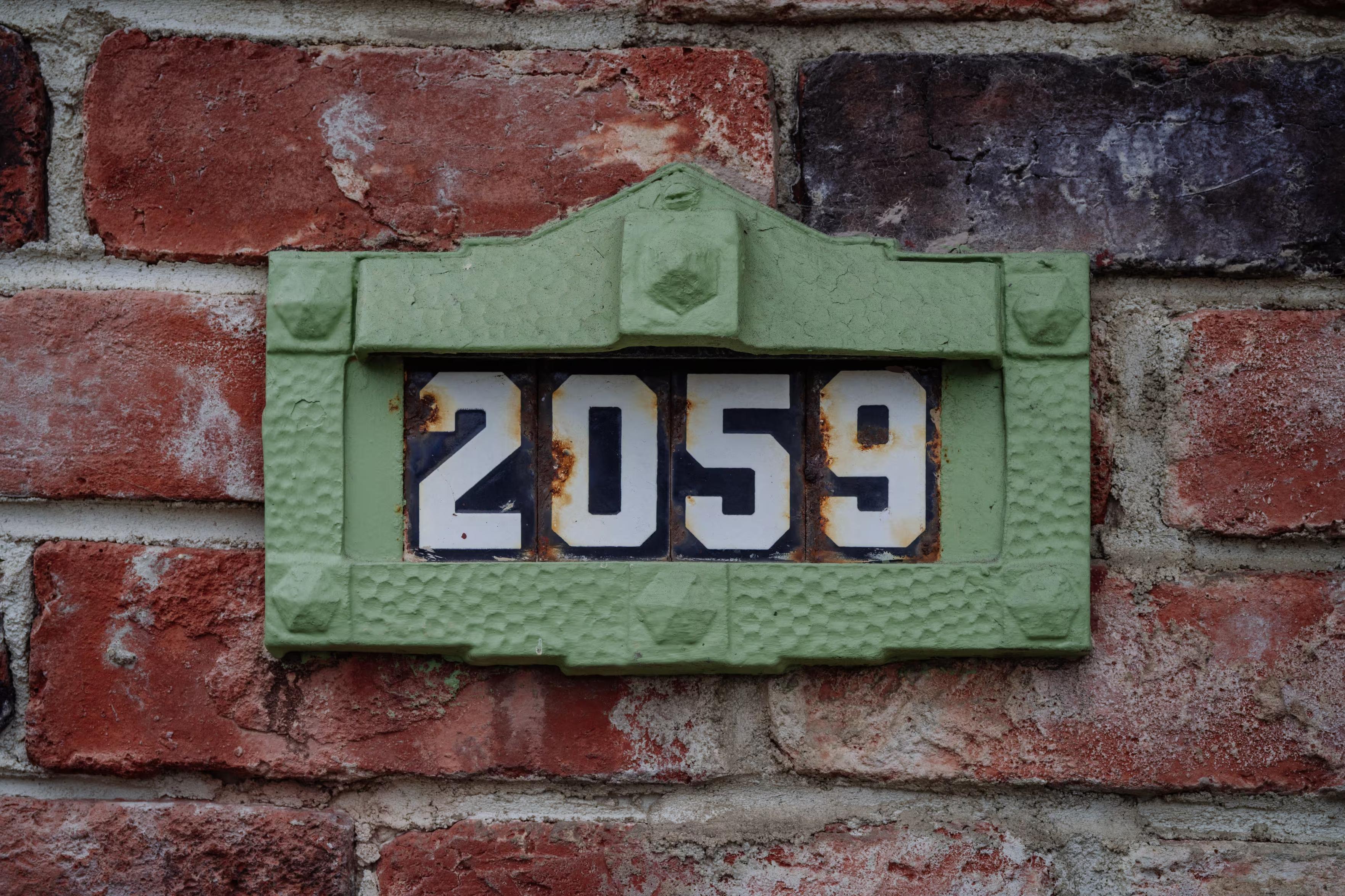
        9.
        I linked to this a while back – more quirky enamel house numbers in the Netherlands.

        mwichary@mastodon.onlineM This user is from outside of this forum
        mwichary@mastodon.onlineM This user is from outside of this forum
        mwichary@mastodon.online
        wrote sidst redigeret af
        #129

        10.
        A pixel font from the NYC Times Square news ticker, 1990s–2000s. (It’s possible this was more of a generic font used elsewhere, but I think it came to be associated with this specific place, time, and purpose.)

        phooky@hexa.clubP 1 Reply Last reply
        0
        • mwichary@mastodon.onlineM mwichary@mastodon.online

          @ricci Thanks! You don’t happen to have a photo or a hint on how to find one?

          ricci@discuss.systemsR This user is from outside of this forum
          ricci@discuss.systemsR This user is from outside of this forum
          ricci@discuss.systems
          wrote sidst redigeret af
          #130

          @mwichary A few examples, that are fairly close to me, I can probably get photos within a week or so if that'd be helpful:

          Sign of the White Horse bar: https://www.whitehorseslc.com/

          Murals by artist Trent Call: https://artistsofutah.org/15Bytes/trent-calls-utah-acme-co-mural-540-n-600-west/, https://payload.cargocollective.com/1/12/395174/5765813/IMG_2535_o.jpg

          A few references should you ever feel like going down the rabbit hole of a 19th century attempt to redesign English orthography:

          https://exhibits.lib.utah.edu/s/designing-deseret/page/home

          https://www.slugmag.com/arts/art/interviews-features/the-lost-and-found-utah-alphabet/

          https://artistsofutah.org/15Bytes/bob-moss-and-the-strange-alphabet-of-utah-pop/

          https://www.press.uillinois.edu/books/?id=p089428

          1 Reply Last reply
          0
          • mwichary@mastodon.onlineM mwichary@mastodon.online

            7.
            East Germany used a particular version of Gill Sans. I love these signs. Very hard to find photos these days.

            finitebaffle@mas.toF This user is from outside of this forum
            finitebaffle@mas.toF This user is from outside of this forum
            finitebaffle@mas.to
            wrote sidst redigeret af
            #131

            @mwichary that Gill fella was all sorts of crazy horrible though oof

            1 Reply Last reply
            0
            • mwichary@mastodon.onlineM mwichary@mastodon.online

              I was hoping for your help with something.

              Is there a particular font that’s instantly recognizable to someone who lives where you do, and appreciated/recognized/hated there, but completely unknown elsewhere? Something on road signs, street names, transit, infrastructure, stuff like that? I’ll share some examples in the thread.

              I’d love to learn more about these. I’m not afraid of links in languages I don’t understand, ha.

              (Also please repost for reach if you are willing!)

              Thank you!

              dhd6@jasette.facil.servicesD This user is from outside of this forum
              dhd6@jasette.facil.servicesD This user is from outside of this forum
              dhd6@jasette.facil.services
              wrote sidst redigeret af
              #132

              @mwichary Montréal house numbers in a characteristic font in white on blue tiles, apparently nobody has any record of who originally designed or manufactured them: https://ville.montreal.qc.ca/memoiresdesmontrealais/les-plaques-dadresse-montrealaises
              https://ici.radio-canada.ca/info/videos/1-7358057/eclectisme-numeros-porte-montrealais

              1 Reply Last reply
              0
              • mwichary@mastodon.onlineM mwichary@mastodon.online

                @slink Yes, thanks! Me too.

                digitalreality@mastodon.me.ukD This user is from outside of this forum
                digitalreality@mastodon.me.ukD This user is from outside of this forum
                digitalreality@mastodon.me.uk
                wrote sidst redigeret af
                #133

                @mwichary @slink for trains in the UK that are not the underground!

                1 Reply Last reply
                0
                • llimllib@hachyderm.ioL llimllib@hachyderm.io

                  @mwichary Massachusetts also has a distinctive town line sign, but I know less about it

                  mwichary@mastodon.onlineM This user is from outside of this forum
                  mwichary@mastodon.onlineM This user is from outside of this forum
                  mwichary@mastodon.online
                  wrote sidst redigeret af
                  #134

                  @llimllib Thanks!

                  1 Reply Last reply
                  0
                  • mwichary@mastodon.onlineM mwichary@mastodon.online

                    I was hoping for your help with something.

                    Is there a particular font that’s instantly recognizable to someone who lives where you do, and appreciated/recognized/hated there, but completely unknown elsewhere? Something on road signs, street names, transit, infrastructure, stuff like that? I’ll share some examples in the thread.

                    I’d love to learn more about these. I’m not afraid of links in languages I don’t understand, ha.

                    (Also please repost for reach if you are willing!)

                    Thank you!

                    moradahmed@mastodon.socialM This user is from outside of this forum
                    moradahmed@mastodon.socialM This user is from outside of this forum
                    moradahmed@mastodon.social
                    wrote sidst redigeret af
                    #135

                    @mwichary This is such a fun question! Typography can be surprisingly local—sometimes a font is so deeply tied to road signs, public transport, or government infrastructure that people recognize it instantly without ever knowing its name. I’m curious to see what everyone comes up with!
                    رد

                    1 Reply Last reply
                    0
                    • mwichary@mastodon.onlineM mwichary@mastodon.online

                      8.
                      Modern Germany has a specific license plate font that's designed to be hard to mess with. It is also used to mark parking spots.

                      https://en.wikipedia.org/wiki/FE-Schrift

                      julian@fietkau.socialJ This user is from outside of this forum
                      julian@fietkau.socialJ This user is from outside of this forum
                      julian@fietkau.social
                      wrote sidst redigeret af
                      #136

                      @mwichary A fun question.

                      Have you come across DIN 1451? It's used for street signs and such in Germany, and was FE-Schrift's predecessor on license plates before the year 2000. I keep a copy of it on my PC in case I need to design something that'll look like an official sign to Germans.

                      https://en.wikipedia.org/wiki/DIN_1451

                      1 Reply Last reply
                      0
                      • mwichary@mastodon.onlineM mwichary@mastodon.online

                        I was hoping for your help with something.

                        Is there a particular font that’s instantly recognizable to someone who lives where you do, and appreciated/recognized/hated there, but completely unknown elsewhere? Something on road signs, street names, transit, infrastructure, stuff like that? I’ll share some examples in the thread.

                        I’d love to learn more about these. I’m not afraid of links in languages I don’t understand, ha.

                        (Also please repost for reach if you are willing!)

                        Thank you!

                        savetheclocktower@mastodon.socialS This user is from outside of this forum
                        savetheclocktower@mastodon.socialS This user is from outside of this forum
                        savetheclocktower@mastodon.social
                        wrote sidst redigeret af
                        #137

                        @mwichary The actual font may not be typographically interesting, but I immediately thought of New Orleans (where I grew up) and the tiles they embed in the sidewalk at corners to mark street names: https://64parishes.org/new-orleans-street-tiles

                        1 Reply Last reply
                        0
                        • mwichary@mastodon.onlineM mwichary@mastodon.online

                          I was hoping for your help with something.

                          Is there a particular font that’s instantly recognizable to someone who lives where you do, and appreciated/recognized/hated there, but completely unknown elsewhere? Something on road signs, street names, transit, infrastructure, stuff like that? I’ll share some examples in the thread.

                          I’d love to learn more about these. I’m not afraid of links in languages I don’t understand, ha.

                          (Also please repost for reach if you are willing!)

                          Thank you!

                          csilverman@mastodon.socialC This user is from outside of this forum
                          csilverman@mastodon.socialC This user is from outside of this forum
                          csilverman@mastodon.social
                          wrote sidst redigeret af
                          #138

                          @mwichary Not sure how much non-designers notice this, but I've always liked how road signage for US national parks was set in Clarendon—Craw Clarendon, I think—not Highway Gothic/Clearview. I'm not aware of any other area that has its own road signage typeface; I'd know these were USNPS signs anywhere. I'll always associate that typeface with camping trips as a kid.

                          (More recently, they've been switching over to NPS Rawlinson Roadway, since it's more compact.)

                          1 Reply Last reply
                          0
                          • mwichary@mastodon.onlineM mwichary@mastodon.online

                            10.
                            A pixel font from the NYC Times Square news ticker, 1990s–2000s. (It’s possible this was more of a generic font used elsewhere, but I think it came to be associated with this specific place, time, and purpose.)

                            phooky@hexa.clubP This user is from outside of this forum
                            phooky@hexa.clubP This user is from outside of this forum
                            phooky@hexa.club
                            wrote sidst redigeret af
                            #139

                            @mwichary The last 30 or so seconds of this film from 1945 has footage of the ticker from around '44. Dunno why it's been stuck in my head for the past 20 years but

                            https://archive.org/details/Tuesdayi1945?start=980

                            1 Reply Last reply
                            0
                            • mwichary@mastodon.onlineM mwichary@mastodon.online

                              I was hoping for your help with something.

                              Is there a particular font that’s instantly recognizable to someone who lives where you do, and appreciated/recognized/hated there, but completely unknown elsewhere? Something on road signs, street names, transit, infrastructure, stuff like that? I’ll share some examples in the thread.

                              I’d love to learn more about these. I’m not afraid of links in languages I don’t understand, ha.

                              (Also please repost for reach if you are willing!)

                              Thank you!

                              jef@mastodon.socialJ This user is from outside of this forum
                              jef@mastodon.socialJ This user is from outside of this forum
                              jef@mastodon.social
                              wrote sidst redigeret af
                              #140

                              @mwichary Fran Sans: https://emilysneddon.com/fran-sans-essay

                              1 Reply Last reply
                              0
                              • mwichary@mastodon.onlineM mwichary@mastodon.online

                                I was hoping for your help with something.

                                Is there a particular font that’s instantly recognizable to someone who lives where you do, and appreciated/recognized/hated there, but completely unknown elsewhere? Something on road signs, street names, transit, infrastructure, stuff like that? I’ll share some examples in the thread.

                                I’d love to learn more about these. I’m not afraid of links in languages I don’t understand, ha.

                                (Also please repost for reach if you are willing!)

                                Thank you!

                                samueljohnson@mstdn.socialS This user is from outside of this forum
                                samueljohnson@mstdn.socialS This user is from outside of this forum
                                samueljohnson@mstdn.social
                                wrote sidst redigeret af
                                #141

                                @mwichary The Cló Gaelach font used on street signs in Ireland (also stamps, many publications in Irish)

                                https://www.rte.ie/news/dublin/2025/0331/1504912-dublin-historic-street-signs/

                                familiar to anyone Irish. Bilingual street signs are uncontroversial in Britain (Welsh in Wales, Scots Gaelic in Scotland, Chinese in parts of London eg) and Ireland but any public signs featuring the Irish language provoke tantrums in parts of Northern Ireland where British loyalists feel threatened by Irish culture.

                                1 Reply Last reply
                                0
                                • mwichary@mastodon.onlineM mwichary@mastodon.online

                                  I was hoping for your help with something.

                                  Is there a particular font that’s instantly recognizable to someone who lives where you do, and appreciated/recognized/hated there, but completely unknown elsewhere? Something on road signs, street names, transit, infrastructure, stuff like that? I’ll share some examples in the thread.

                                  I’d love to learn more about these. I’m not afraid of links in languages I don’t understand, ha.

                                  (Also please repost for reach if you are willing!)

                                  Thank you!

                                  malte@radikal.socialM This user is from outside of this forum
                                  malte@radikal.socialM This user is from outside of this forum
                                  malte@radikal.social
                                  wrote sidst redigeret af
                                  #142

                                  @mwichary A classic in typefaces many places, the national train signage where I live is well reckognized and appreciated. Designed by local type foundry Kontrapunkt that has done several other very reckognizable public typefaces and can be read about here: https://kontrapunkt.com/work/dsb


                                  1 Reply Last reply
                                  0
                                  Svar
                                  • Svar som emne
                                  Login for at svare
                                  • Ældste til nyeste
                                  • Nyeste til ældste
                                  • Most Votes


                                  • Log ind

                                  • Har du ikke en konto? Tilmeld

                                  • Login or register to search.
                                  Powered by NodeBB Contributors
                                  Graciously hosted by data.coop
                                  • First post
                                    Last post
                                  0
                                  • Hjem
                                  • Seneste
                                  • Etiketter
                                  • Populære
                                  • Verden
                                  • Bruger
                                  • Grupper