Skip to content
  • Hjem
  • Seneste
  • Etiketter
  • Populære
  • Verden
  • Bruger
  • Grupper
Temaer
  • Light
  • Brite
  • Cerulean
  • Cosmo
  • Flatly
  • Journal
  • Litera
  • Lumen
  • Lux
  • Materia
  • Minty
  • Morph
  • Pulse
  • Sandstone
  • Simplex
  • Sketchy
  • Spacelab
  • United
  • Yeti
  • Zephyr
  • Dark
  • Cyborg
  • Darkly
  • Quartz
  • Slate
  • Solar
  • Superhero
  • Vapor

  • Default (No Skin)
  • No Skin
Kollaps
FARVEL BIG TECH
  1. Forside
  2. Ikke-kategoriseret
  3. I was hoping for your help with something.
I was hoping for your help with something.
Planlagt Fastgjort Låst Flyttet Ikke-kategoriseret
142 Indlæg 58 Posters 0 Visninger
  • Ældste til nyeste
  • Nyeste til ældste
  • Most Votes
Svar
  • Svar som emne
Login for at svare
Denne tråd er blevet slettet. Kun brugere med emne behandlings privilegier kan se den.
  • mwichary@mastodon.onlineM mwichary@mastodon.online

    6.
    Also in San Francisco, there are these classic distinctive house numbers.

    The story is here if you are curious: https://sunnysidehistory.org/2020/07/15/the-little-sculpture-affixed-your-house-anton-fazekas/

    mwichary@mastodon.onlineM This user is from outside of this forum
    mwichary@mastodon.onlineM This user is from outside of this forum
    mwichary@mastodon.online
    wrote sidst redigeret af
    #73

    7.
    East Germany used a particular version of Gill Sans. I love these signs. Very hard to find photos these days.

    grmon@chaos.socialG mwichary@mastodon.onlineM kallekn@mastodonsweden.seK finitebaffle@mas.toF 4 Replies Last reply
    0
    • florine@mastodon.greenF florine@mastodon.green

      @mwichary all over, I think. And at least 50 years old

      mwichary@mastodon.onlineM This user is from outside of this forum
      mwichary@mastodon.onlineM This user is from outside of this forum
      mwichary@mastodon.online
      wrote sidst redigeret af
      #74

      @florine Thanks!

      1 Reply Last reply
      0
      • mwichary@mastodon.onlineM mwichary@mastodon.online

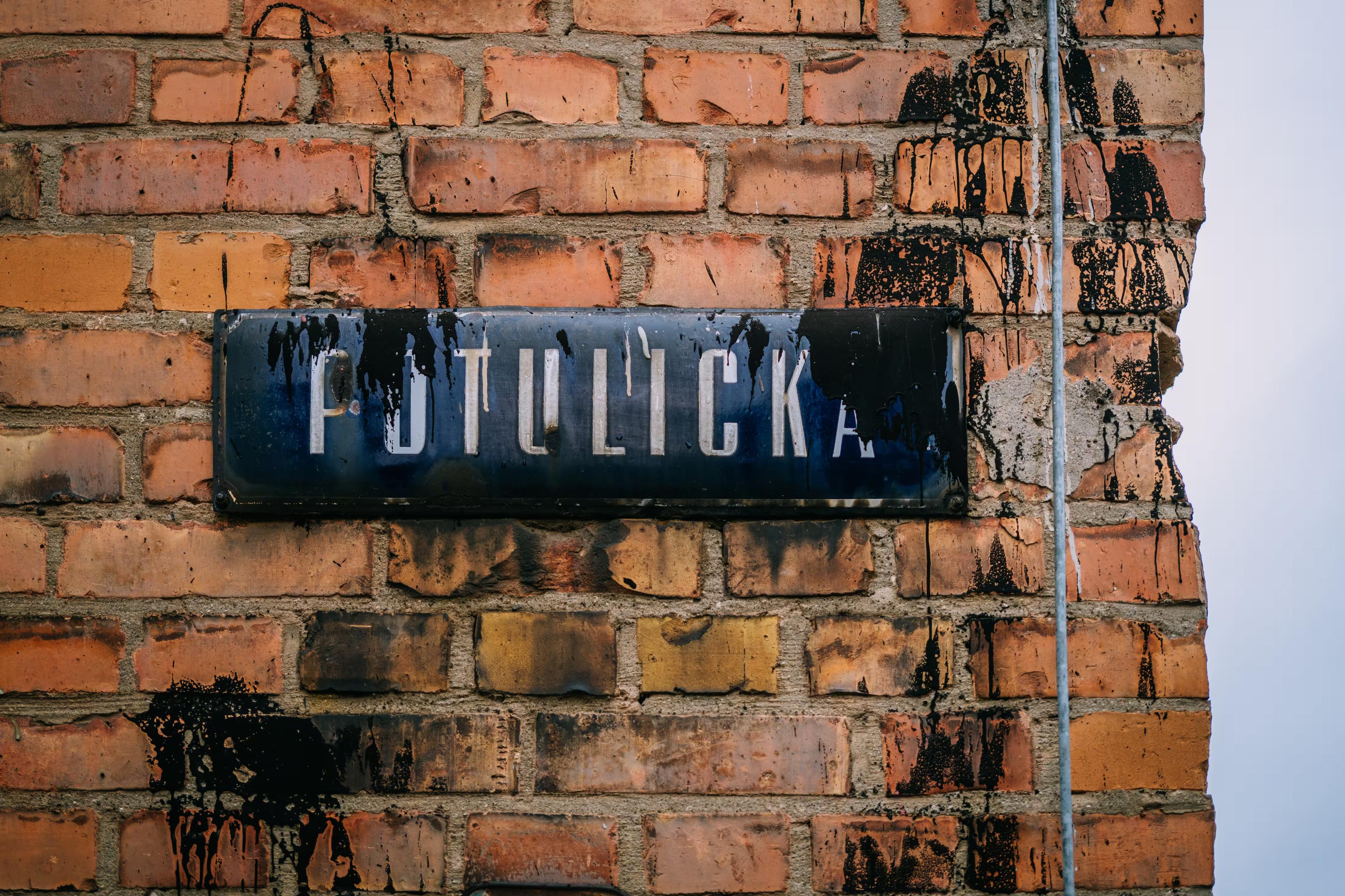
        I was hoping for your help with something.
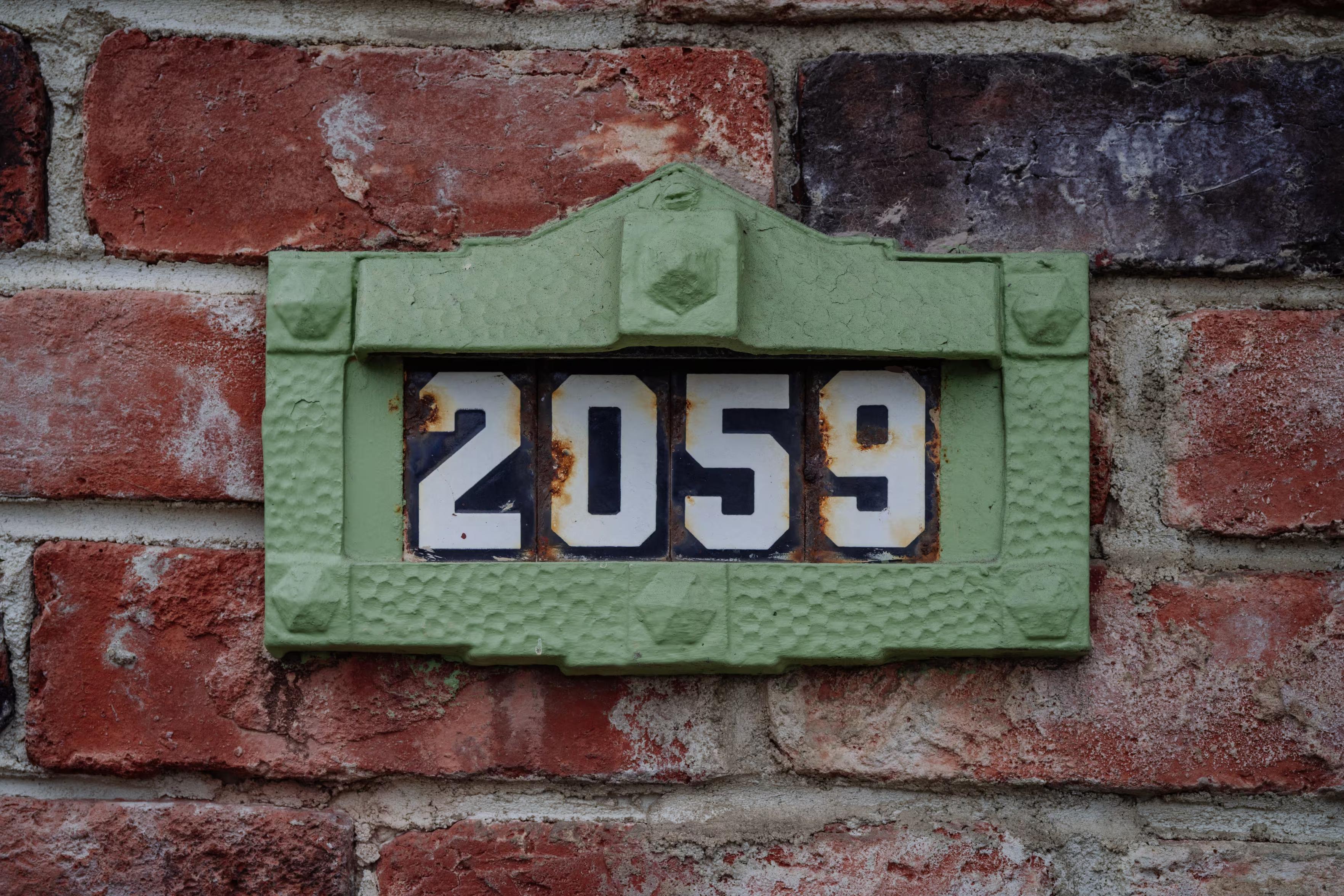
        Is there a particular font that’s instantly recognizable to someone who lives where you do, and appreciated/recognized/hated there, but completely unknown elsewhere? Something on road signs, street names, transit, infrastructure, stuff like that? I’ll share some examples in the thread.

        I’d love to learn more about these. I’m not afraid of links in languages I don’t understand, ha.

        (Also please repost for reach if you are willing!)

        Thank you!

        aschmitz@ostatus.lardbucket.orgA This user is from outside of this forum
        aschmitz@ostatus.lardbucket.orgA This user is from outside of this forum
        aschmitz@ostatus.lardbucket.org
        wrote sidst redigeret af
        #75

        @mwichary I've seen it pop up in one or two non-Chicago things, but I'd say the Big Shoulders font family qualifies. Locals probably mostly don't know the name, but it's on a lot of Chicago stuff (not just official city things, either, though sometimes on stuff that wants to seem like it) and not really anywhere else.

        mwichary@mastodon.onlineM 1 Reply Last reply
        0
        • mwichary@mastodon.onlineM mwichary@mastodon.online

          I was hoping for your help with something.

          Is there a particular font that’s instantly recognizable to someone who lives where you do, and appreciated/recognized/hated there, but completely unknown elsewhere? Something on road signs, street names, transit, infrastructure, stuff like that? I’ll share some examples in the thread.

          I’d love to learn more about these. I’m not afraid of links in languages I don’t understand, ha.

          (Also please repost for reach if you are willing!)

          Thank you!

          jqno@mastodon.onlineJ This user is from outside of this forum
          jqno@mastodon.onlineJ This user is from outside of this forum
          jqno@mastodon.online
          wrote sidst redigeret af
          #76

          @mwichary Tilburg (the Netherlands) has TilburgsAns (sic): designed by two local artists as a tribute to the town, and has since been adopted almost everywhere: billboards, monuments, labels on local products (even my blog 😄)

          The news section of their website has many examples of usage: https://www.tilburgsans.nl/en/news/

          1 Reply Last reply
          0
          • mwichary@mastodon.onlineM mwichary@mastodon.online

            @ricci Thanks! You don’t happen to have a photo or a hint on how to find one?

            ricci@discuss.systemsR This user is from outside of this forum
            ricci@discuss.systemsR This user is from outside of this forum
            ricci@discuss.systems
            wrote sidst redigeret af
            #77

            @mwichary I'm sure I have some in my photo storage somewhere, but am failing to find them - I'm sure I can find or take some new ones soon

            1 Reply Last reply
            0
            • mwichary@mastodon.onlineM mwichary@mastodon.online

              7.
              East Germany used a particular version of Gill Sans. I love these signs. Very hard to find photos these days.

              grmon@chaos.socialG This user is from outside of this forum
              grmon@chaos.socialG This user is from outside of this forum
              grmon@chaos.social
              wrote sidst redigeret af
              #78

              @mwichary Gill, the guy who did terrible things to his daughter and dog and wrote it down? https://www.telegraph.co.uk/news/2022/04/28/christies-cancels-paedophile-artist-eric-gill-abused-daughters/ #thingsthatcannotbeunseen #thingsthatcannotbeforgotten

              mwichary@mastodon.onlineM 1 Reply Last reply
              0
              • grmon@chaos.socialG grmon@chaos.social

                @mwichary Gill, the guy who did terrible things to his daughter and dog and wrote it down? https://www.telegraph.co.uk/news/2022/04/28/christies-cancels-paedophile-artist-eric-gill-abused-daughters/ #thingsthatcannotbeunseen #thingsthatcannotbeforgotten

                mwichary@mastodon.onlineM This user is from outside of this forum
                mwichary@mastodon.onlineM This user is from outside of this forum
                mwichary@mastodon.online
                wrote sidst redigeret af
                #79

                @grmon Oh shit, I wasn’t aware of the extent of all this.

                grmon@chaos.socialG u47@mastodon.socialU 2 Replies Last reply
                0
                • secretasianman@types.plS secretasianman@types.pl

                  @mwichary there's the house face of the TTC subway in Toronto which is similar but different than Johnston Sans

                  michaelgemar@cosocial.caM This user is from outside of this forum
                  michaelgemar@cosocial.caM This user is from outside of this forum
                  michaelgemar@cosocial.ca
                  wrote sidst redigeret af
                  #80

                  @secretasianman @mwichary I wish the TTC would use it more consistently, and more whole-heartedly embraced it.

                  1 Reply Last reply
                  0
                  • scruss@xoxo.zoneS scruss@xoxo.zone

                    @mwichary @secretasianman there's a whole saga about how the Toronto's TTC was going to release a free version of the font, but had a massive falling out with the project proponent.

                    michaelgemar@cosocial.caM This user is from outside of this forum
                    michaelgemar@cosocial.caM This user is from outside of this forum
                    michaelgemar@cosocial.ca
                    wrote sidst redigeret af
                    #81

                    @scruss @mwichary @secretasianman There are “unofficial” versions floating around.

                    secretasianman@types.plS 1 Reply Last reply
                    0
                    • mwichary@mastodon.onlineM mwichary@mastodon.online

                      7.
                      East Germany used a particular version of Gill Sans. I love these signs. Very hard to find photos these days.

                      mwichary@mastodon.onlineM This user is from outside of this forum
                      mwichary@mastodon.onlineM This user is from outside of this forum
                      mwichary@mastodon.online
                      wrote sidst redigeret af
                      #82

                      8.
                      Modern Germany has a specific license plate font that's designed to be hard to mess with. It is also used to mark parking spots.

                      https://en.wikipedia.org/wiki/FE-Schrift

                      kyonshi@dice.campK mwichary@mastodon.onlineM me_@sueden.socialM julian@fietkau.socialJ 4 Replies Last reply
                      0
                      • mwichary@mastodon.onlineM mwichary@mastodon.online

                        I was hoping for your help with something.

                        Is there a particular font that’s instantly recognizable to someone who lives where you do, and appreciated/recognized/hated there, but completely unknown elsewhere? Something on road signs, street names, transit, infrastructure, stuff like that? I’ll share some examples in the thread.

                        I’d love to learn more about these. I’m not afraid of links in languages I don’t understand, ha.

                        (Also please repost for reach if you are willing!)

                        Thank you!

                        grmon@chaos.socialG This user is from outside of this forum
                        grmon@chaos.socialG This user is from outside of this forum
                        grmon@chaos.social
                        wrote sidst redigeret af
                        #83

                        @mwichary there is a very ugly black letter font here in Annaberg-Buchholz #tourist #workation sometimes with perfect usage of German long-s and for the same street with wrong end-s . Gonna try to snatch some pictures.

                        mwichary@mastodon.onlineM 1 Reply Last reply
                        0
                        • mwichary@mastodon.onlineM mwichary@mastodon.online

                          I was hoping for your help with something.

                          Is there a particular font that’s instantly recognizable to someone who lives where you do, and appreciated/recognized/hated there, but completely unknown elsewhere? Something on road signs, street names, transit, infrastructure, stuff like that? I’ll share some examples in the thread.

                          I’d love to learn more about these. I’m not afraid of links in languages I don’t understand, ha.

                          (Also please repost for reach if you are willing!)

                          Thank you!

                          fanf@mendeddrum.orgF This user is from outside of this forum
                          fanf@mendeddrum.orgF This user is from outside of this forum
                          fanf@mendeddrum.org
                          wrote sidst redigeret af
                          #84

                          @mwichary david kindersley’s lettering, designed for motorway road signs, but rejected, and instead relatively popular for street name signs (especially in his home town cambridge)

                          https://www.flickr.com/photos/36844288@N00/albums/72157621886573981/

                          https://wemadethis.co.uk/blog/2022/02/street-name-fonts/

                          https://thebeautyoftransport.com/2021/11/03/how-serifs-lost-the-road-war-but-won-the-streets/

                          fanf@mendeddrum.orgF 1 Reply Last reply
                          0
                          • grmon@chaos.socialG grmon@chaos.social

                            @mwichary there is a very ugly black letter font here in Annaberg-Buchholz #tourist #workation sometimes with perfect usage of German long-s and for the same street with wrong end-s . Gonna try to snatch some pictures.

                            mwichary@mastodon.onlineM This user is from outside of this forum
                            mwichary@mastodon.onlineM This user is from outside of this forum
                            mwichary@mastodon.online
                            wrote sidst redigeret af
                            #85

                            @grmon Thanks in advance!

                            1 Reply Last reply
                            0
                            • mwichary@mastodon.onlineM mwichary@mastodon.online

                              I was hoping for your help with something.

                              Is there a particular font that’s instantly recognizable to someone who lives where you do, and appreciated/recognized/hated there, but completely unknown elsewhere? Something on road signs, street names, transit, infrastructure, stuff like that? I’ll share some examples in the thread.

                              I’d love to learn more about these. I’m not afraid of links in languages I don’t understand, ha.

                              (Also please repost for reach if you are willing!)

                              Thank you!

                              jwildeboer@social.wildeboer.netJ This user is from outside of this forum
                              jwildeboer@social.wildeboer.netJ This user is from outside of this forum
                              jwildeboer@social.wildeboer.net
                              wrote sidst redigeret af
                              #86

                              @mwichary Munich has a regulation about these blue/white house numbers. While it is not exactly defined which font to use, it almost always is this serif one. @Szescstopni

                              1 Reply Last reply
                              0
                              • mwichary@mastodon.onlineM mwichary@mastodon.online

                                @grmon Oh shit, I wasn’t aware of the extent of all this.

                                grmon@chaos.socialG This user is from outside of this forum
                                grmon@chaos.socialG This user is from outside of this forum
                                grmon@chaos.social
                                wrote sidst redigeret af
                                #87

                                @mwichary I know. It’s horrible. The font is pretty nice.

                                mwichary@mastodon.onlineM linuxandyarn@hachyderm.ioL 2 Replies Last reply
                                0
                                • mwichary@mastodon.onlineM mwichary@mastodon.online

                                  8.
                                  Modern Germany has a specific license plate font that's designed to be hard to mess with. It is also used to mark parking spots.

                                  https://en.wikipedia.org/wiki/FE-Schrift

                                  kyonshi@dice.campK This user is from outside of this forum
                                  kyonshi@dice.campK This user is from outside of this forum
                                  kyonshi@dice.camp
                                  wrote sidst redigeret af
                                  #88

                                  @mwichary yeah, the specific idea is that one cannot easily change a letter into a different letter by adding stuff (like changing a P into an R, or an F into an E). The letter forms have been designed to be unique to make alterations easier to detect.

                                  1 Reply Last reply
                                  0
                                  • chemlon@mastodon.socialC chemlon@mastodon.social

                                    @mwichary

                                    Metron by Jiří Rathouský (1973), Prague Metro, Czechia. Digitized by František Štorm.

                                    https://www.stormtype.com/families/metron/gallery

                                    vfig@mastodon.gamedev.placeV This user is from outside of this forum
                                    vfig@mastodon.gamedev.placeV This user is from outside of this forum
                                    vfig@mastodon.gamedev.place
                                    wrote sidst redigeret af
                                    #89

                                    @chemlon @mwichary oooh! there were so many interesting typographical forms in signage all over prague when i visited there. i took photos in every metro station i went to—absolutely loved the sleek lines of this face. excited to learn theres a digital version!

                                    1 Reply Last reply
                                    0
                                    • mwichary@mastodon.onlineM mwichary@mastodon.online

                                      8.
                                      Modern Germany has a specific license plate font that's designed to be hard to mess with. It is also used to mark parking spots.

                                      https://en.wikipedia.org/wiki/FE-Schrift

                                      mwichary@mastodon.onlineM This user is from outside of this forum
                                      mwichary@mastodon.onlineM This user is from outside of this forum
                                      mwichary@mastodon.online
                                      wrote sidst redigeret af
                                      #90

                                      9.
                                      I linked to this a while back – more quirky enamel house numbers in the Netherlands.

                                      mwichary@mastodon.onlineM 1 Reply Last reply
                                      0
                                      • mwichary@mastodon.onlineM mwichary@mastodon.online

                                        I was hoping for your help with something.

                                        Is there a particular font that’s instantly recognizable to someone who lives where you do, and appreciated/recognized/hated there, but completely unknown elsewhere? Something on road signs, street names, transit, infrastructure, stuff like that? I’ll share some examples in the thread.

                                        I’d love to learn more about these. I’m not afraid of links in languages I don’t understand, ha.

                                        (Also please repost for reach if you are willing!)

                                        Thank you!

                                        floy@mystical.gardenF This user is from outside of this forum
                                        floy@mystical.gardenF This user is from outside of this forum
                                        floy@mystical.garden
                                        wrote sidst redigeret af
                                        #91

                                        @mwichary DB Neo, corporate typeface of deutsche bahn is quite recognizable for people in Germany. It's not used on station signage or wayfinding, but it is used in advertisements, the app and website and passenger information system on some trains

                                        https://marketingportal.extranet.deutschebahn.com/marketingportal/Marke-und-Design/Basiselemente/Typografie

                                        floy@mystical.gardenF 1 Reply Last reply
                                        0
                                        • mwichary@mastodon.onlineM mwichary@mastodon.online

                                          8.
                                          Modern Germany has a specific license plate font that's designed to be hard to mess with. It is also used to mark parking spots.

                                          https://en.wikipedia.org/wiki/FE-Schrift

                                          me_@sueden.socialM This user is from outside of this forum
                                          me_@sueden.socialM This user is from outside of this forum
                                          me_@sueden.social
                                          wrote sidst redigeret af
                                          #92

                                          @mwichary And unfortunately made easy to read for automatic license plate readers, increasing the surveillance opportunities - while still causing lots of trouble in parking garages using crappy automatic readers…


                                          1 Reply Last reply
                                          0
                                          Svar
                                          • Svar som emne
                                          Login for at svare
                                          • Ældste til nyeste
                                          • Nyeste til ældste
                                          • Most Votes


                                          • Log ind

                                          • Har du ikke en konto? Tilmeld

                                          • Login or register to search.
                                          Powered by NodeBB Contributors
                                          Graciously hosted by data.coop
                                          • First post
                                            Last post
                                          0
                                          • Hjem
                                          • Seneste
                                          • Etiketter
                                          • Populære
                                          • Verden
                                          • Bruger
                                          • Grupper