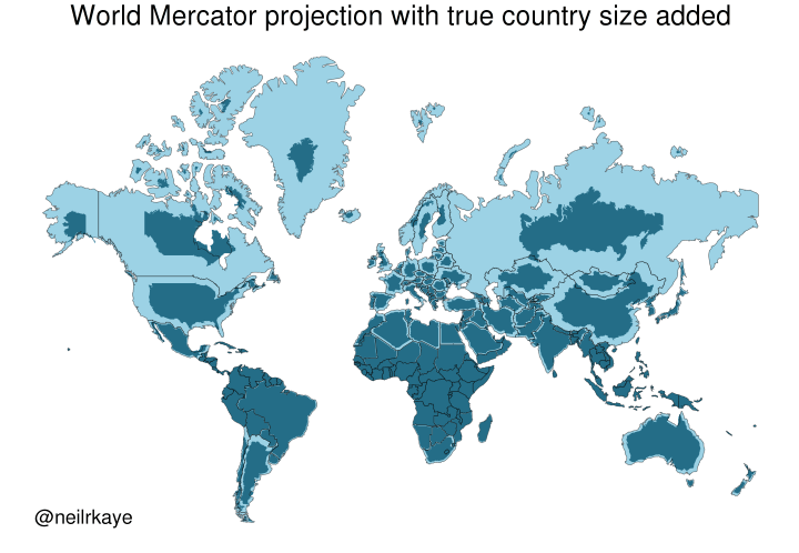
Yet another reason to tut at the Mercator map projection
-
@infobeautiful i’m definitely a fan of the Peters Projection.
I clearly remember a 🤯 moment from first or second grade when I saw it for the first time!
@infobeautiful Pro tip: If you stretch Peter's projection "widescreen", it retains more of the shapes of the continents you are used to. (This might be my favorite world map)
-
@stevefaeembra @lokjo @x_tof @infobeautiful
This one substitutes the Prime Meridian for the equator. (Hilarity ensues)@Osteopenia_Powers @stevefaeembra @lokjo @x_tof @infobeautiful
Finally a map with a biblically accurate Australia -
Yet another reason to tut at the Mercator map projection
https://brilliantmaps.com/mercator-vs-true-size/@infobeautiful Exquisite sub-toot.
-
@infobeautiful Very useful to see. Done by a professional, so I must be wrong, but where I am (north New Zealand) is at about the same latitude as San Francisco, but we seem to be less shrunk?
Re discussion about more realistic projections, my favourite is Cahill-Keyes. http://www.genekeyes.com/world_map_poster.html
@quixote @infobeautiful Here is a better Cahill-Keyes world map, without the extremely misleading overlaid rectangular grid. Instead, just actual geographic parallels and meridians are shown. Also, Antarctica is handled better, even if partially duplicated.
But as always with non-contiguous projections, there will be small or even large islands that get split, or at least separated widely from their close neighbours. And the easternmost bit of Siberia is cut off from the rest.
I am sure that if this was a widely used projection, people would also start more or less wild theories that distortions in this map projection is a cause of some foreign policies. From Wikipedia: https://en.wikipedia.org/wiki/Cahill%E2%80%93Keyes_projection
-
@quixote @infobeautiful Here is a better Cahill-Keyes world map, without the extremely misleading overlaid rectangular grid. Instead, just actual geographic parallels and meridians are shown. Also, Antarctica is handled better, even if partially duplicated.
But as always with non-contiguous projections, there will be small or even large islands that get split, or at least separated widely from their close neighbours. And the easternmost bit of Siberia is cut off from the rest.
I am sure that if this was a widely used projection, people would also start more or less wild theories that distortions in this map projection is a cause of some foreign policies. From Wikipedia: https://en.wikipedia.org/wiki/Cahill%E2%80%93Keyes_projection
@tml @infobeautiful _And_ it includes Antarctica! Excellent map.
Plus maps are always better when the political boundaries are not the main thing.
-
Sure, projecting a quasi-spheroid onto a plane will always cause distortions, but you can choose what to distort. Mercator keeps compass bearings and distorts shapes. The Albers Equal-Area projection, among others, keeps sizes but distorts shapes much more. Anyway, you can always calculate the surface area of land. In fact many countries in the world have been quite thoroughly surveyed.
@tsukkitsune @toddhorowitz @infobeautiful
This!!
I asked in my ArcGIS class if the distortions resulted from using the ideal shapes of classic geometry to try to fit across the random shapes of the actual Earth. With the implied corollary of who got to choose which wrongness.
That guy said "Whoah! That [very basic question] is a bit above my pay grade" and skipped to the next question.
-
@libroraptor @infobeautiful Indeed! I was surprised to hear that NZ is about the same size as California from top to bottom and side to side. They have a lot of nerve just constantly dropping us off world maps all the time, don't they?

@quixote @libroraptor @infobeautiful
Yep - and dropping all y'all off world economies, too!
Can we see a Mercator/GDP projection pulleeze?
-
@quixote @libroraptor @infobeautiful
Yep - and dropping all y'all off world economies, too!
Can we see a Mercator/GDP projection pulleeze?
@terminally_shy @quixote @infobeautiful It may be advantageous not to appear on US maps.
-
@terminally_shy @quixote @infobeautiful It may be advantageous not to appear on US maps.
With our own government decapitating the entities who would have generated those maps, I'd say there's no present danger.
The current crop of pseudo scientists installed into the hollowed out homes of formerly renowned U.S. expertise are no threat.
-
Yet another reason to tut at the Mercator map projection
https://brilliantmaps.com/mercator-vs-true-size/@infobeautiful slightly odd. i admit i don't understand, but why is, say, australia not as shrunk as canada? surely it's as far south of the equator as canada is north?
-
Yet another reason to tut at the Mercator map projection
https://brilliantmaps.com/mercator-vs-true-size/@infobeautiful This book is a great discussion of examples like this(the title is relevant to the current commentary) :
-
@infobeautiful slightly odd. i admit i don't understand, but why is, say, australia not as shrunk as canada? surely it's as far south of the equator as canada is north?
@fishidwardrobe @infobeautiful
Canada goes from (mostly) 49°N (49th parallel) to around 70°N on the mainland, but up to about 82.5°N on Ellesmere Island.
Australia goes from between 10°S on Mabuiag Island and 10.7°S at Cape York on the mainland in the north, down to 39°S on the mainland, or 43.6°S in Tasmania.
So, no. The furthest part of Australia from the equator is closer to the equator than the main southern border of Canada.
Next time you see a map, look where the equator actually is!
-
@BobDevney @infobeautiful You can’t do that.
@IcooIey @BobDevney @infobeautiful Why not?

-
A very bad graphic. The point is taken but that map is very inaccurate. Eg the Canadian southern border should fit perfectly with the USA but it is shrink way too much. There are much better maps which account for there projection errors.
@sleepy62 @infobeautiful oh dear. Point totally missed